Visiting the Annual Olympia International Art & Antiques Fair (June 5-15)
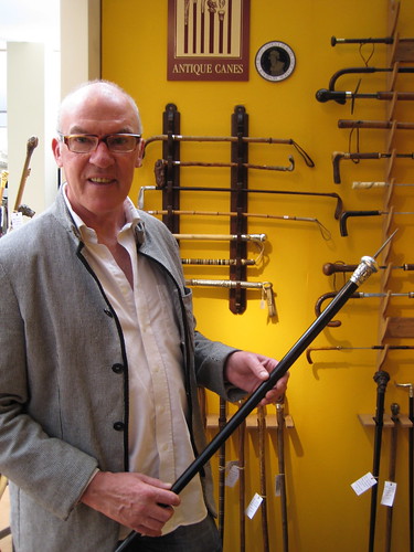
Cane dealer and scholar, Geoffrey Breeze, showing me one of his favorite canes currently on show at Olympia.
“You do not carry a cane. You wear a cane.” The foremost English cane dealer, Geoffrey Breeze, told me. At the time, he was holding a late-eighteenth-century English cane with an extending metal blade. (“I’d rather wear it than have it wear me,” was the running commentary in my head.)
It was just one of many fascinating things–and equally fascinating interactions–I had at this year’s Olympia Fair.
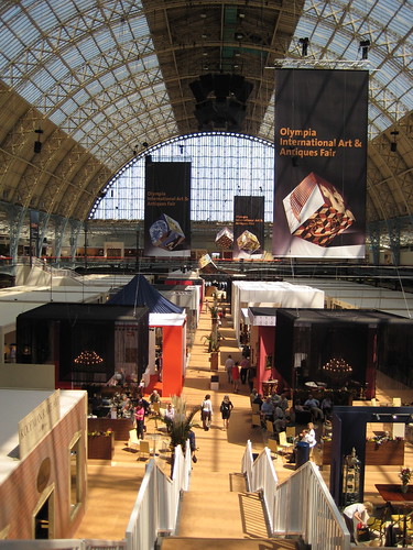
A view of the Fair from the upper level.
Olympia, as it is commonly referred to here, has taken place every June for 30 years. Dealers in fine and decorative arts gather from around the world to showcase their best works. The range of objects on view is enormous.
Before the fair opens to the public, dealers are required to submit their pieces to a vetting process. As a result, only items of a certain quality are available for sale. This means that no one is likely to find a diamond in the rough; but, it also ensures visitors see mostly diamonds.
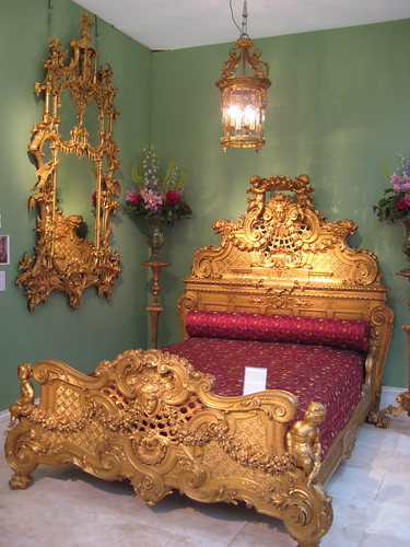
Gilt-wood English pier glass (c. 1770) together with a French Louis XIV gilt-wood bed (c. 1870) from Butchoff.
I oppose the idea of putting a French Louis XIV bed, with its weightier, more muscular carving together with a playful, English Rococo mirror, but it’s hard to resist all the glitter they create together. Of the two, the mirror is the more impressive.
This is one of three magnificent mirrors on show at Butchoff. There is growing trend of collecting mirrors. To the average person, it may be hard to put a mirror in the same category as high art. Cheap and ready access to mirrors in almost any home furnishing store diminishes our expectation of them. However, these mirrors were some of the most expensive and luxurious items of their day.
The mirror above was either the product of or heavily influenced by the designs of Thomas Chippendale’s Gentleman and Cabinet-Maker’s Director, published in 1755 (First Edition). It was likely made in the last quarter of the eighteenth century.
Chippendale was influenced by imported Asian art, especially lacquer and ceramics that depicted scenes of scholars, Buddhist temples, dragons, and plants, little understood but copied by European ceramicists, textile makers, and furniture designers.
By the 1800, glass technology had not progressed to the point where a large, continuous sheet could be made. The process of making even small panes was expensive and time consuming and required the use of dangerous chemicals like lead and mercury.
The above mirror appears to consist of at least six panes, which are cleverly separated by gilt wood carving.
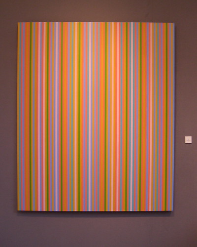
I know very little about the painter Bridget Riley. Over the past year, Riley’s paintings have been increasingly seen in fairs and art galleries throughout London, but usually on a smaller scale that make the works look like creative bar codes. Not usually a fan of non-traditional painting, I was drawn to this work. (I literally saw it from across a room and, ignoring everything else, walked until I was standing in front of it.)
The combination of its large scale and tiny, multi-colored lines made this one of the most pleasant and–perish the word!–interesting paintings I have seen. (For a complete discussion on why “interesting” is a poor word for art criticism, read Leo Tolstoy’s What is Art? I’ll post on it later.) Riley’s paintings are all done by hand, not by machine. Up close, it would be fair to call them painterly, as each stroke is visible. The execution of the piece reminded me of the Russian Suprematist work Black Square (1915) by Kasimir Malevich, who painted simple geometric shapes by hand.
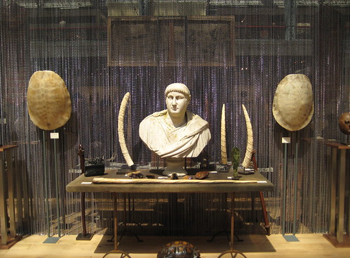
The testosterone emanating from this booth had me quoting Theodore Roosevelt the rest of the day. (“Bully!”) Carved elephant tusks to either side of the marble bust, a narwhal tusk lying on the table, sea turtle shells . . . all in front of the manly backdrop of chains.
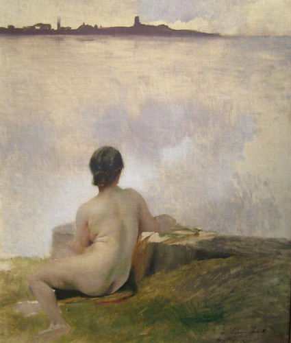
Albert Besnard (1849-1934) Nude Looking Out to the Sea (1885), oil on canvas, 21 3/4 BY 18IN. (55 BY 46CM.) Available from Constantine Art.
This was my favorite painting from Olympia. Though not the most important work–I’m sure it was little noticed by most people–it is a beautiful, meditative painting.
Besnard’s father studied under Jean-Auguste-Dominique Ingres, and Besnard himself studied in the studio of Alexandre Cabanel. By age 19, Besnard was already showing works in the Salon.
This work is part of a tradition of nymph paintings, which were popular during the 1870s and 1880s. Perhaps the most famous work in this category is Opal (1881) by Anders Zorn. The paintings usually feature a nude, other-worldly woman in a natural setting.
The result is usually boudoir and mildly-erotic. But the effect of this painting is not sexual; it is full of melancholy. I found myself looking over her shoulder into that large abstract expanse with a kind of contentment I haven’t felt from a painting in some time.
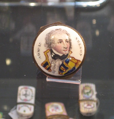
On a less-serious note, what English antiques fair would be complete without an Admiral Lord Nelson enamel snuff box? Yours for a mere £300 (about $600) from the Antique Enamel Company.
The American Scene at the British Museum: Prints from 1900-1960
Note: I have used several high-resolution images in this post. Depending on the speed of your internet connection, it may take a few moments to properly load them all.
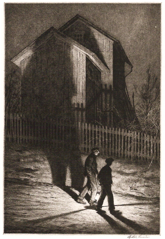
Martin Lewis HA’NTED (1932) Drypoint with sandpaper-ground, 33.3 BY 22.6CM or 13 BY 9IN. (Although one of the least-featured works in the exhibition, it is one of my favorites.)
The British Museum has the largest collection of American prints outside the United States. Much of its collection has come from the artists’ families themselves. Over a hundred prints are now on view in the in Museum’s Print Room. In addition, a beautiful catalog, The American Scene: Prints from Hopper to Pollock, has been printed to accompany the exhibition. It includes many high-quality, little-published images. It is also beautifully written by Stephen Coppel, who is a great storyteller.
The American Scene exhibition is on show until September 7 at the British Museum. For those who can’t be there in person, the exhibition website has an interactive section worth visiting. Because it is just around the corner from me, I’ve been able to sneak away, sometimes with my three-year-old son asleep in his stroller, to see some of the pieces several times.
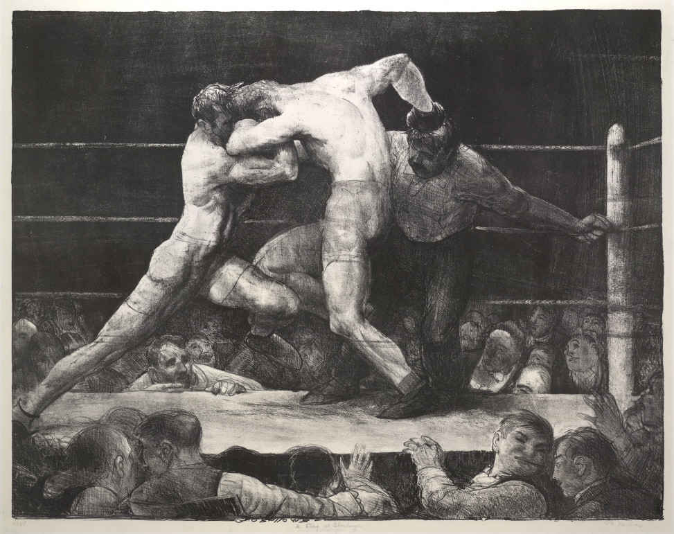
George Bellows A Stag at Sharkey’s (1917) Lithograph, 47.5 BY 61CM. or 18 3/4 BY 24IN.
A Stag at Sharkey’s (1917) illustrated a time in the US when public boxing matches were illegal. To avoid prosecution and simultaneously gather paying crowds, gyms would have private boxing clubs. Members would pay dues to the gym in place of tickets and the matches would be held behind closed doors. George Bellows (1882-1925) was a regular viewer and sometimes participated in the matches. He was even given the boxing name “Chicago Whitey.”
Bellows was born in Columbus, Ohio where he studied as Ohio State University and hoped to eventually become a professional baseball player. Instead, he studied under Robert Henri and John Sloan in New York at the Ashcan School. There he gained a solid foundation in drawing and painting the human figure, which is reflected in the above work.
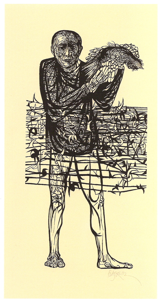
Leonard Baskin MAN OF PEACE (1952) Woodcut on oriental paper 158 BY 78.7CM or 62 1/8 BY 31IN.
Together with his equally pessimistic work The Hydrogen Man, this piece by Leonard Baskin (1922-2000) greets everyone entering the exhibition. I couldn’t help but wonder if the Museum curator who placed them there was making a statement about the United States’ current wars in Iraq and Afghanistan. (It seems like at least twice a week I’m told by European acquaintances how the US is finally learning its lesson.) Maybe I’m projecting.
In any case, this work was meant to be an anti-war piece reflecting discontent with the Korean and Cold Wars in America. That’s a dead dove in the man’s hands. I think it is wonderfully effective in expressing the intended message and the kind of complicated emotions people felt at the time.
Despite my short-lived angst with their prominent display in a show whose mood they do not proportionately represent, while looking at Baskin’s two works I found myself reflecting on my own pessimism, anger, sadness, regret, and helplessness that I feel about the current war in Iraq.
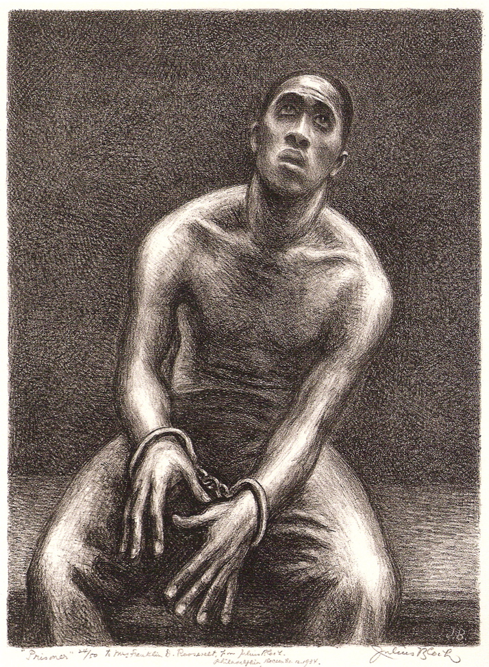
Julius Bloch THE PRISONER (1934) Lithograph 34 BY 25.3CM. or 14 3/8 BY 10IN.
Julius Bloch (1888-1966) was heavily influenced by French Realism from the late nineteenth century (e.g. Jean-François Millet) and American painters Thomas Eakins and Robert Henri. This work shows a kind of stripped-down simplicity that still borrows from a solid understanding of the human figure. (Look at the figure’s chest and sides as the shoulders rise forward and they bend inwards. Wow.)
The Prisoner at once emanates sadness and hope. I found myself staring at it for a few minutes, lost in thought. It reminded me of the meditative paintings of seventeenth-century Bolognese painters like Guido Reni and Ludovico Carracci.
From page 147 of the exhibition catalog:
The model was Alonzo Jennings, who had sat for an earlier portrait. In his journal Bloch described the placing of handcuffs on Jennings: ‘I had a horror of putting them on him, but he only laughed, and said, “I’ll trust you to take them off again.'” (Bloch, Journals, no. 3, 25 November 1933)
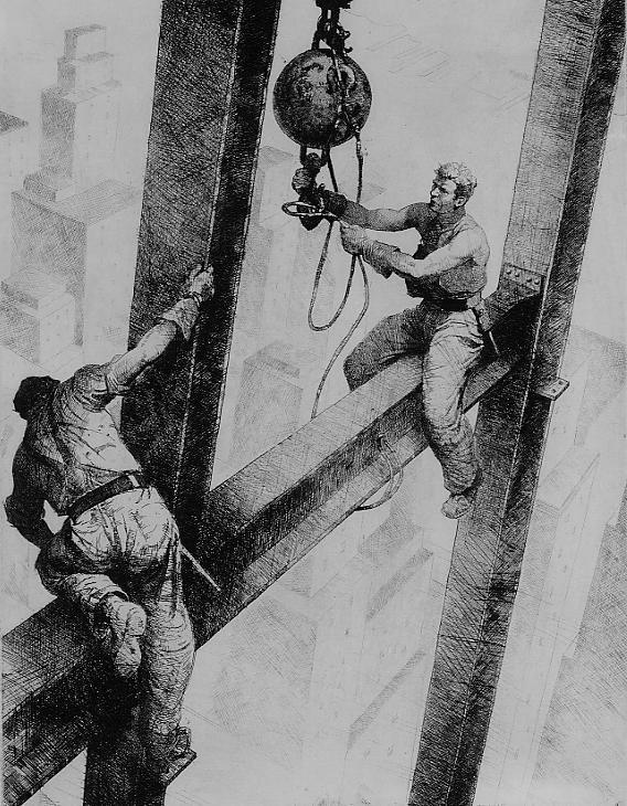
James Allen The Connectors (1934) Etching, 32.7 BY 25CM. or 12 7/8 BY 9 7/8IN.
Is there anything more American than building skyscrapers during the Depression? I submit that it stands aside hot dogs, baseball, apple pie, and John Wayne movies. The rising forms of buildings, soaring heavenward, must have been statues of optimism in a time when it was difficult to feel good about the future.
The Connectors depicts two workers supposedly working on the Empire State Building during the height of the Depression. As was the case with most workers, they are high above the ground without safety harnesses or scaffolding. James Allen (1894-1964) did a number of construction-worked pieces. I wonder how much of this piece is taken from first-hand experience or from Allen’s imagination. Having served as a US pilot in WWI, he was no stranger to dangerous heights.
(He is not the same James Allen that wrote the essay As a Man Thinketh that is given to almost every hormonal teenager in my hometown.)
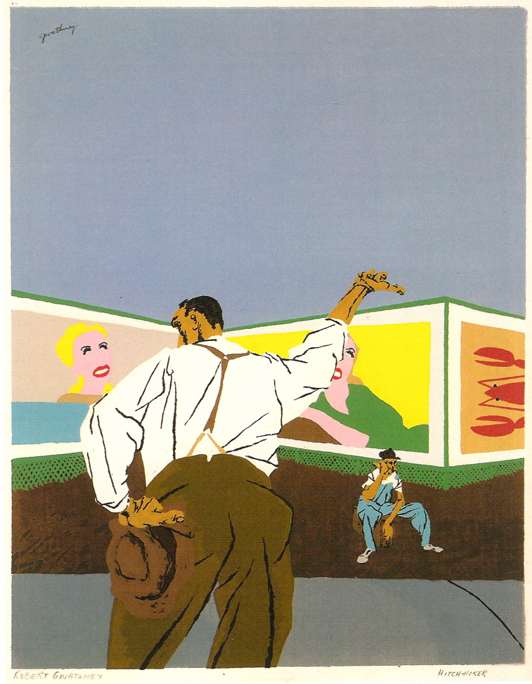
Robert Gwathmey THE HITCHHIKER (1937) Solor screenprint, 42.8 BY 33.3CM. or 16 7/8 BY 13IN.
The Hitchhiker is one of the promotional pieces used by the Museum to advertise the exhibition, and can be seen all over London. According to the Coppel label for the work, it is based on the only early painting by the artist that he did not destroy. That explains why several online searches for other works by Robert Gwathmey (1903-1988) had little result.
Gwathmey was a native Virginian who trained in Baltimore, Philadelphia and Europe. Later in life, his efforts were more as a teacher than producing artist.
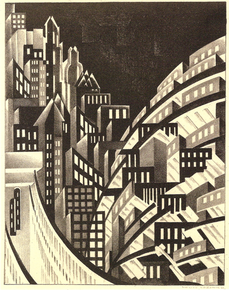
Louis Lozowick New York (c. 1925) Lithograph, 29.2 BY 22.9CM. or 11 1/2 BY 9IN.
As a Russian Jew born near the turn of the century, Louis Lozowick (1892-1973) may have known my grandfather, a Jew living near Lozowick’s hometown. Lozowick studied art in Kiev, but was forced to leave during the Russian revolution of 1905.
New York is his most famous work. Comparing it to works by Natalia Goncharova, a Cubo-futurist painter, it appears that Lozowick was heavily influenced by his Russian background. According to Coppel, Lozowick knew some of the major Russian artists of the day: Kasimir Malevich, Vladimir Tatlin, and El Lissitsky.
My wife lived in Manhattan for several years. Seeing this lithograph, she said “I really, really miss New York,” saying it was like living in a “man-made canyon.”
—
I’ve now been to the exhibition four times. For an American living in London, seeing images that carry a distinctly American flavor is like having comfort food. I plan on going many times more.
Sotheby’s Nineteenth-Century Auction Deserves a Good Look and Read
I spent Sunday afternoon at the preview for Sotheby’s 19th Century European Paintings auction in London. (The auction will take place on May 30, together with nineteenth-century Scandinavian works.) I was so overwhelmed with the quantity and quality of paintings, that I went back this morning to take a second look.
While there, I had a wonderful time with Adrian Biddell, Head of the Nineteenth-Century Department, Claude Piening, Senior Director, and the specialist Marta Enille. They were each generous, showing me their personal favorites and sharing a wealth of information that, due to other considerations, cannnot fit into an auction catalog.
In a classroom setting, I once asked well-respected scholar what the difference between a museum catalog and auction catalog is. Her answer: “Length.” Several of the pieces at the auction merit the kind of in-depth, drawn-out study than an auction catalog (or blog) can’t give. For my part, I hope that many of these paintings resurface after the auction in order to be seen and written about at greater length.
I have pictured a few pieces here that I liked. They are not all the most highly valued ones at the auction, but they set off a spark in me.
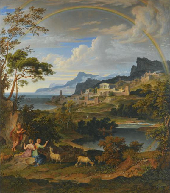
Heroische Landschaft Mit Regenbogen (Heroic Landscape with Rainbow) by Joseph Anton Koch (42 3/4 X 37 3/4 in.)
In Heroische Landschaft mit Regenbogen, as in his other heroic landscapes, [. . .] Koch showed that neoclassicism could and should seamlessly blend into Romanticism and have ideological motivations. The picture spirits the viewer into a timeless, bygone realm populated by shepherds and shepherdesses.
This is the last of four copies of this painting by Koch. The other three are in major museums.
Far from being his premiere pensée, it was painted over a decade after the first version. Instead of spontaneity, it shows a mature structure not found in the other three.
As in Poussin’s work–a comparison made by Piening in the catalog–the viewer is carefully drawn into the depth of the painting and shown around through visual devices (e.g. paths, figures, mountain slopes) that makes it difficult to look away. The clouds mimic the hills, which mirror the buildings.
While the composition shows lessons learned from Poussin and Claude, the rich coloring borrows from a Northern European tradition seen in landscapes by Rubens and Brill.
It is a wonderful and strange combination of the two traditions, Classic and Northern landscape.
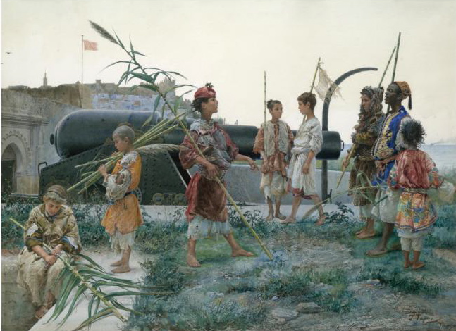
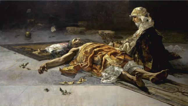
The Presentation by José Tapiró (Spanish, 1836-1913) 19 1/2 X 27 1/2 in. watercolor and gouache on paper.
This is not a major painting by a major painter, but it sings. It is one of many Orientalist paintings and sculptures at the auction.
The painting depicts a group of young boys pretending to be guards with shaved branches instead of guns. It appears to be fun and games until a canon in the middle ground of the painting indicates that they are on the ramparts of a defended city.
It is beautifully composed and technically stunning, reflecting Tapiró’s academic training in Reus, Barcelona, and Rome.
Each boy tells a story in his face. While looking at it, I found myself remembering childhood friends I thought I’d forgotten, but who just needed a little prodding from this piece to float back to the surface.
The Watchful Eye–The Vigil by Salvador Sánchez Barbudo (Spanish, 1857-1917) 58 X 100 1/2 in.
This is another Spanish painter who studied in Rome.
It is the kind of painting that an interior designer would find difficult because it is not, as one once told me, “optimistic.” This is a painting where the artist’s skill is immediately evident.
I have to admit that I feel very little emotional connection to this painting. For my part, the title gives too little information to make the narrative clear, but the subject isn’t interesting enough to make me curious about much else than the composition.
I was totally fascinated by its construction. As Marta Enille pointed out to me, the woman is beautifully done. But it is the sprawled-out figure of the man that fascinates me. The difficult, angular pose of the unconscious man and woman in profile could easily have been done another way or less convincingly. It seems effortless in person.
It is perfectly large painting. Any smaller and it would have made the sprawled figure of the man unconvincing; any larger and he would have seemed unreal.
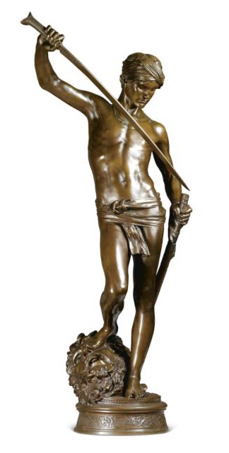
David Apres le Combat (David After the Battle) Jean-Antonin Mercié (French, 1845-1916) 44 in.
According to the catalog, this work was:
modified during [Mercié’s] sojourn in Rome at the French Academy and was undoubtedly an extremely bold statement which begged comparison with seminal works of the Renaissance by Verrocchio, Donatello and Michelangelo. However, Mercié’s youthful hero, with his effete charm and overtones of orientalism, could never be mistaken for a Renaissance work. It was exhibited at the Salon of 1872.
The picture hardly does it justice. In person, I felt refined in its presence. Rather than effete, it seems regal, serene.
It seems to me that every narrative has its own convincing medium. This is yet another proof that David and Goliath is best seen in 3D.
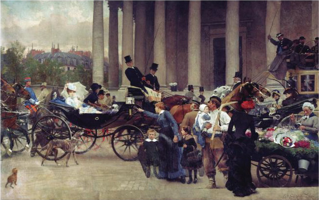
Les Deux Soeurs (The Two Sisters) by Charles Giron (Swiss, 1850-1914) 172 X 248 3/4 in.
Of all the paintings I have seen this year, I was least prepared for this. I spent over an hour dwarfed by it. It is nearly 15 feet tall and 21 feet long with figures in actual scale. As a result, the viewer is appropriated into the painting without need for imagination.
It needs to be seen to be believed.
According to Claude Piening, who researched the painting for the sale, it showed in the 1883 Paris Salon “causing reams of commentary” at the time.
This painting could be subtitled “the beginning of the end of history painting.” It is done in the scale of classical history paintings championed by the Ecole des Beaux-Arts, even at this late date. The background features classical columns, but the scene is entirely contemporary — real people in everyday clothing and events.
The central narrative is of two sisters, one with three children and a husband obviously accustomed to manual labor and the other sister in silk clothing and a horse-drawn carriage. The poorer sister shoots an accusatory finger towards the other, as if publicly calling her out as a girl-for-hire.
No one but the two women and the husband seem to understand the deep emotional nature of the moment. The flower woman, in a masterfully painted effect, holds a string in her mouth as she ties a bouquet for a customer, the traffic continues its pace, and the children seem to be unaware of the conflict.
I have contacted several people about this painting in hopes that, at least, I can find it an appreciative home with visitation rights.
Vox populi, vox Dei?

I have been reading The Rest Is Noise by Alex Ross, music critic for the New York Times. It is a stunningly clear way of looking at the story of twentieth century music. (It was nominated for the 2008 Pulitzer Prize.) In it, Ross brings up several arguments that have not been settled. Ross’ discussion of the atonal–as opposed to melodic–music movement has me wondering about whether or not music, and art of the same period that went through a similar rejection of tradition, should be popular or if the arts are mean to be the playground of the few, the elite.
On May 16, 1906 Richard Strauss conducted his opera Salome in the Austrian city of Graz. Kings, composers, and, supposedly, a seventeen-year-old Hitler were present. Salome was a departure from traditional opera. Besides the gruesome, controversial topic (i.e. the beheading of John the Baptist followed by a necrophilic aria sung to his severed head) it was more atonal than melodic. Surprisingly, it was an instant success.
The composer and Strauss’ friend, Gustav Mahler, was there for opening night and the congratulatory parties:
On the train back to Vienna [where he was working as a conductor], Mahler expressed bewilderment over his colleague’s success. He considered Salome a significant and audacious piece–“one of the greatest masterworks of our time,” he later said–and could not understand why the public took an immediate liking to it. Genius and popularity were, he apparently thought, incompatible. Traveling in the same carriage was the Styrian poet and novelist peter Rosegger . . . [He] replied that the voice of the people is the voice of God–Vox populi, vox Dei. Mahler asked whether he meant the voice of the people at the present moment or the voice of the people over time. Nobody seemed to know the answer to that question.
(Ross, Alex. The Rest Is Noise. Fourth Estate: London, 2008. p. 9. Emphasis added)
Mahler’s question has been ringing in my ears since I read it. By asking whether or not the people’s opinion matters, it flies in the face of Strauss’ student, Schoenberg who said: “If it is art, it is not for all . . . and if it is for all, it is not art.”
Schoenberg’s opinion squares with nearly 100 years of art criticism, which has consistently preached a rejection of courting popular appreciation in exchange for deliberately difficult art. If that is what they wanted, they got it. It has led to a popular lack of comprehension and consequently a lack of interest in art.

Why Is this Day Different? Michael Brecker as photographed by my camera phone at the Royal Free Hospital, London.
Last week, my wife had minor surgery at the Royal Free Hospital in London. The Hospital had a wall covered in contemporary art being sold for the benefit of various charities. As my wife and I walked by, a woman standing in front of a collage work said to her companion “It’s not really art, is it!? I don’t get it.”
Vox populi.
What did she mean by “not really art”? Without her explanation, I can only guess that she meant that Michelangelo’s David by comparison would be art. David exhibits obvious above-average skill to create. On the second statement, “I don’t get it,” she suggests that comprehensibility would help he appreciate it.
The above piece doesn’t seem, on the surface, to meet the first of her supposed requirements. (Regardless of the work involved, collage art will never been seen as something requiring extraordinary skill.)
As for subject, it is unspecific in that it could be interpreted many ways depending on individual perspective. Its lack of specificity is a barrier to comprehension. The lack of comprehension in collage art has been deliberate since the beginning.
It has been nearly 100 years since Picasso and Braque introduced collage. At the time, Picasso commented to Braque in a letter that “if it was understood, it was boring.”
When talking about the people and their perspective of art, a central issue is comprehensibility. Debussy argued that music should be deliberately difficult in order to deter the passing interests of lesser minds.
My friends who collect and love contemporary art are tired of me talking about the deliberate, or even accidental, obfuscation of subject and lack of specificity in collage art and its sister movements. They think 100 years has settled the issue. But, I have to remind them that it has only been 100 years. “One hundred years?!” is the usual reaction. (As if art were subject to the same product cycle as the next model of Apple’s iPhone.) Prices are only one indication of the value of art.
Ars longa. Vita brevis.
Painting Study by Lord Frederick Leighton
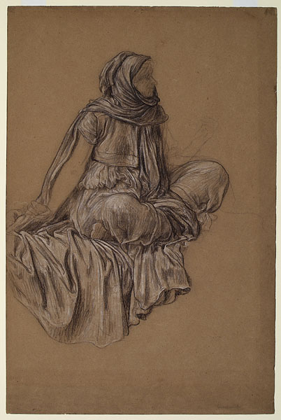
Lord Frederick Leighton, Study for Captive Andromache (1888); White and black chalk on brown paper
Lord Frederick Leighton, Captive Andromache (1888), DETAIL

Lord Frederick Leighton, Captive Andromache (1888). Click here for a larger image.
I was researching another artist when I stumbled across the website for Leighton House Museum, dedicated to preserving the memory and collection of the painter Lord Frederick Leighton. The Museum has digitized its collection of his drawings.
Leighton was appointed President of the Royal Academy in London in 1878. His highly realistic approach to this sketch reflects the values of the Academy in his day.
As can be seen above, the woman in his sketch is much younger than that appearing in the final version of the painting. The purpose of the sketch was to explore the drapery and not the woman’s features, which accounts for the lack of detail in the face and limbs and the detail in the fabric that faithfully appears in the final work.
—
Are we training artists or publicists?
Disclaimer: This post briefly discusses the work of an artist that some may find offensive.

The recent, morally-objectionable work of a Yale University student has some questioning the current state of art education in this and other US universities. It makes me wonder if schools are training artists or public relations experts.
The student, Aliza Shvarts, “preformed repeated self-induced miscarriages” after inseminating herself with sperm from volunteers. The “performance” was part of an undergraduate art project meant to raise questions about abortion, society, and the female body.
The Yale Daily News interviewed Shvart in an article titled “For senior, abortion a medium for art, political discourse.” (Side note: If abortion is considered a “medium,” what else can be considered part of an artist’s toolkit? Car wrecks? Assault? Suicide?) From the article:
The display of Schvarts’ project will feature a large cube suspended from the ceiling of a room in the gallery of Green Hall. Schvarts will wrap hundreds of feet of plastic sheeting around this cube; lined between layers of the sheeting will be the blood from Schvarts’ self-induced miscarriages mixed with Vaseline in order to prevent the blood from drying and to extend the blood throughout the plastic sheeting.
Schvarts will then project recorded videos onto the four sides of the cube. These videos, captured on a VHS camcorder, will show her experiencing miscarriages in her bathrooom tub, she said. Similar videos will be projected onto the walls of the room.
Shvarts is quoted as saying: “I think I am creating a project that lives up to the standard of what art is supposed to be.” She also stated, “I hope it inspires some sort of discourse.”
“It inadvertently raises an entirely different set of questions: How exactly is Yale teaching its undergraduates to make art? Is her project a bizarre aberration or is it within the range of typical student work?“ wrote Michael Lewis in a recent article for the Wall Street Journal, discussing Shvarts’ work.
Lewis, a Professor of Art at Williams College, goes on to explore a series of issues central to how anyone begins to assess art:
It is often said that great achievement requires in one’s formative years two teachers: a stern taskmaster who teaches the rules and an inspirational guru who teaches one to break the rules. But they must come in that order. Childhood training in Bach can prepare one to play free jazz and ballet instruction can prepare one to be a modern dancer, but it does not work the other way around. One cannot be liberated from fetters one has never worn; all one can do is to make pastiches of the liberations of others. And such seems to be the case with Ms. Shvarts.
Amen. Futher on, he writes:
Immaturity, self-importance and a certain confused earnestness will always loom large in student art work. But they will usually grow out of it. What of the schools that teach them? Undergraduate programs in art aspire to the status of professional programs that award MFA degrees, and there is often a sense that they too should encourage the making of sophisticated and challenging art, and as soon as possible. Yale, like most good programs, requires its students to achieve a certain facility in drawing, although nowhere near what it demanded in the 1930s, when aspiring artists spent roughly six hours a day in the studio painting and life drawing, and an additional three on Saturday.
Given the choice of this arduous training or the chance to proceed immediately to the making of art free of all traditional constraints, one can understand why all but a few students would take the latter. But it is not a choice that an undergraduate should be given. In this respect — and perhaps only in this respect — Ms. Shvarts is the victim in this story.
Double Amen.
Two weeks ago, my wife and I had dinner with a professor of art at a top-25 ranked US university. I am not a professor of art nor an artist. I am an art historian accustomed to studying artist studios and schools a hundred years old or older where artists used to train. I wanted to find the answer to a seeming contradiction: how can universities teach art in an climate where anything seems permissible? What standards are used by educators to determine whether or not a student is making progress or if he or she is even good?
In answering my questions, the professor stayed away from terms like “good” and “bad,” preferring to refer to students as being “unique” and “individually inspired.” He summed up the teaching method as making sure students “hit what they are aiming at.” The professor was repulsed by my ideas regarding classical training as being necessary for artistic excellence. He believed such training was optional. In some cases, he considered training as intolerant of and damaging to nascent artistic talent. In other words, unhindered artistic talent is the goal. Consequently, untrained immaturity is confused with unsullied innocence. Not only should artists not be taught, but teaching can be damaging and morally repugnant.
I wondered what Yo-Yo Ma, who is currently part of a large, non-classical orchestra project, would say about squashing his capacity or freedom through rigorous training.
As William F. Buckley, Jr. once said referring to a similarly confusing turn of logic, I wanted to “knock something off the table to make sure that gravity still functioned.”
A culture where standards are absent leads to what I call “the artistic arms race.” When there are no standards for judging what is good or bad (or skilled versus unskilled), art is judged by the attention it receives. Courting controversy becomes the standard method for success. Controversy then equals quality. The skills necessary for creating art are more aligned with Public Relations than with trained artistic talent.
I am not saying that there are no standards in all or even most universities. Dr. Lewis, who wrote the Wall Street Journal article, teaches art at a US university. He obviously has standards.
I know living artists who are extremely gifted and work hard to develop those gifts. I like some of their art and I don’t like others’. This is not a question of producing art that the majority of people like–though that would be nice too. It is not about dumbing down art or lowering standards.
For me, this is about progress. Can art progress without rigor or discipline? Science is progressing, answering questions that it was asking in decades past and coming up with new questions. Is art progressing or is it rotting?
American Artist Interview with the Painter Jacob Collins

Male Figure by Jacob Collins (Graphite and white chalk on paper, 2001) From Jacob Collins’ website.

Thinking Man by Jacob Collins (Oil on canvas, 30 X 20 in., 2004). From Jacob Collins’ website.
Last year, I had the opportunity to spend a weekend with Jacob. His passion is electrifying. With it, he has opened three schools for the training of new artists in traditional academic techiniques, such as rigorous draftsmanship, first from plaster casts and, then, nude models. He is uncompromising in his approach to his own work and instills the same in his own students. The results can be seen in his own work.

Fire Island Sunset by Jacob Collins (Oil, 2004, 24 X 38 in.) Private Collection. Illustrated on the American Artist Magazine website.
Allison Malifronte of American Artist Magazine recently talked with Jacob. The interview pincipally focuses on his latest school, The Hudson River School for Landscape, based on the group of artists from the nineteenth century by the same name. Here is an excerpt from Malifronte’s conversation. (Note “AA” refers to American Artist Magazine, not a twelve-step program.):
AA: If you could offer an aspiring landscape painter one piece of advice, what would it be?
JC: Last year I read Asher B. Durand’s “Letters on Landscape Painting,†and I was struck by the advice he gave to aspiring landscape artists to draw the individual pieces of the landscape for as long as it takes to understand them before putting it all together. He recommended perhaps even years of drawing branches of trees and rocks, outcroppings, and clusters of trees with a sharp pencil, seeing them as the alphabet of the landscape. I was impressed with his analogy that trying to paint a landscape without learning this alphabet was like trying to write a novel without learning the letters and words of language.
(For the full article, click here.)
As lover of art, I appreciate this kind coverage of Jacob Collins. It shows that there is a greater diversity in current art production than glossy magazines and blockbuster contemporary exhibitions would lead many to believe. And, Malifronte’s interview focuses on the craftsmanship of Jacob’s work. Her questions do a wonderful job of capturing what drives his passion on ground level, not just a 10,000-foot view of his work. This is an approach that makes American Artist Magazine such a valuable resource for not only artists, but for art historians, dealers, and collectors of art. (No, they did not pay me to write that.)
As an art historian, it allows me to understand what is happening in the mind of an artist looking back at the nineteenth century that doesn’t survive in remaining nineteenth century journals. I have read Eugene Delacroix’s journals (and others’), and I do not feel that he wrote much of his working method down in a context that we can easily piece it together. This could be because he lived in a culture where much of his approach was ubiquitous and mundane. The shortening of Jacob’s name in the article to “JC” may be most appropriate because he is resurrecting not just the art, but the understanding–and, therefore, the appreciation–of it.
For more paintings by Jacob Collins, I highly suggest visiting his website here. It has a large collection of images of his work. (My only complaint is that there is not more recent work available on it.)
Masters & Pupils: The Artistic Succession from Perugino to Manet (1480-1880)

Cover of the book by Gert-Rudolf Flick
Many would be surprised to learn that Manet, considered by many to be the first artist of the modern period, was the last in a long line of teachers going back to Perugino. In his book Masters& Pupils: The Artistic Succession from Perugino to Manet 1480 to 1880, Gert-Rudolf Flick traces the artistic genealogy of Manet connecting him to Carracci, Raphael and many of the greatest artists in Western history.
From the inside flap:
The line of descent that connects Perugino with Manet is made up of just eighteen artists. Some are household names such as Raphael and David. Others, for example, Horace Le Blanc and Louis Boullogne, have fallen into obscurity. All are connected by a common bond: the belief that art could be taught and learned, and that skill and knowledge would be passed on from an older artist to a younger. With Manet, the succession came to a halt, marking the end of a great tradition but also the beginning of the modern art wold, in which the desirability of teaching art has been thrown into question.
Flick traces the genealogy with an in-depth exploration of each artist in the line–eighteen in all–together with examples of each artist’s work.
These days, we do not talk much about the dynastic traditions carried down from one artist to another. For example, we talk of philosophical connections between Warhol and Banksy, but not where they studied. The idea of training an artist seems counter to the freedom inherent in our conception of “artistic expression.” How can an artist be trained by someone and, then, be expected to create something worthwhile?
The idea that tradition and training stifles an artist’s god-given talent may have begun with Manet. Together with other artists of his day, he had an antagonistic relationship with the art establishment in Paris.
In the last half of the nineteenth century, the annual Paris Salons were the premiere showcase for painters. Over 20,000 people would visit the Salon daily. Artists whose work appeared in the show were much more likely to be commercially successful. For every painting shown in the Salon ten were rejected.
A group of elite people, a mix of government appointees and past winners judged the Salon and accepted or rejected paintings. These judges were often teachers in the Ecole des Beaux-Arts and would reward their own students. It was a system that had tremendous stakes for artists who felt artistic merit was often subject to nepotism and rigid decisions. (For a very entertaining and accurate description of this struggle in the last quarter of the nineteenth century, I suggest reading Ross King’s The Judgment of Paris: The Revolutionary Decade that Gave the World Impressionism.)
It was, I believe, this institutional favoritism–teacher favoring student–in the academic system that led to the ultimate downfall of the master and pupil system. It bred a resentment in Manet’s generation, ultimately resulting a series of artistic movements (e.g. Impressionism, Divisionism, Futurism, etc.) that opposed academic training. By rejecting the system and encouraging others to do the same, Manet laid the foundation for its destruction.
Flick remains even-handed in his approach to the topic; not casting doubt on the idea that artists are born not trained. Reading the book, it is difficult to not come to the conclusion that the system should have been reformed rather than lost.
While it is true that there are many talented artists today, few of them can participate in a system that allows them to instill that talent in another generation. As a result, each generation discovers painting for themselves. This leads to a lot of fresh ideas, but severs them and us from the experience that leads to deeper understanding.
If Newton “stood on the shoulders of Giants,” where do the artists from Manet to today place their feet? That is the question that haunts this book and one that we need to have a serious debate about.
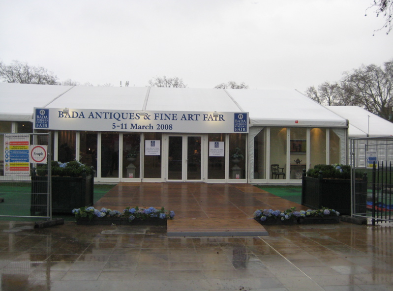
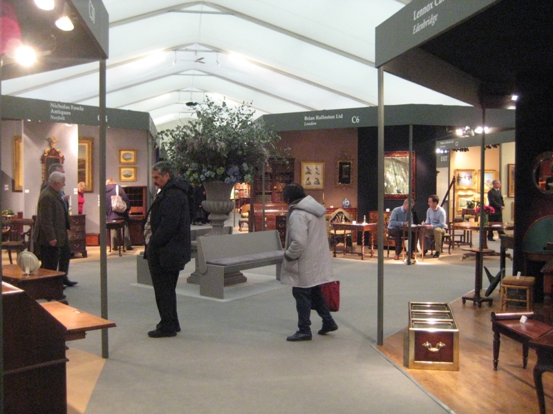
BADA London 2008
Right on the heels of TEFAF in Maastricht (See previous post), I visited the British Antique Dealers’ Association (BADA) Annual Fair in London. It runs from March 5 to 11. I wish it would have lasted longer.
The Fair gathers Fine and Decorative Art dealers from all over Great Britain. Somewhat naively, I had assumed that all the major art dealers would be located in London. I was wrong. For those interested in meeting knowledgeable dealers of a wide variety of affordable and high-end works of art, this is a great place to start.
Having just come back from TEFAF in Maastricht, it was hard not to draw comparisons between the two. BADA was much more personal. There was less pretense.
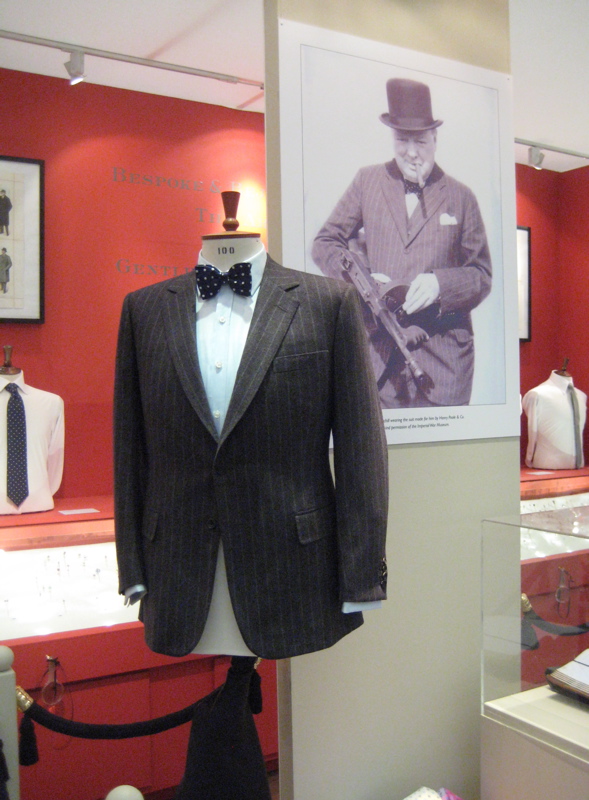
As expected, there were many paintings–my particular interest–from Great Britain, but I found dealers with strong networks in Continental nineteenth-century painting as well. I would post images of these paintings, but dealers were concerned about distributing sold works online. I did, however, get the seller Henry Poole & Co. to allow me to post a suit made for Winston Churchill for sale at BADA.
How British.
TEFAF Maastricht 2008

Cover from the guide to TEFAF
Friday, I took the train from London’s St. Pancras International to Maastricht. It was the opening weekend of The European Fine Art Foundation (TEFAF) held in Maastricht in the Netherlands from March 7 to 16, 2008.
Unlike museums with limited budgets, dealers at TEFAF have the cash and motivation to restore paintings. Nearly every painting had a new coat of shiny, barely-dried varnish. On one hand, paintings looked nearly new. On the other hand, some paintings had been through so many iterations of cleaning and varnishing that paint had become dangerously thin, obscuring brushwork and coloring. I often felt I was looking at them through an unfocused lens.

One of the many booths dedicated to Old Masters paintings
It was overwhelming to see so many Old Masters works under one roof. I was especially impressed by Richard L. Feigen & Co. (New York) and Whitfield Fine Art Ltd. (London). I could name a dozen others dealers in the Old Masters paintings wing. I wish I could say the same for nineteenth-century art.
There were myriad Monets and a plethora of Pissaros, but where were the academic painters?! I saw a Gerome, a L’Hermitte, and a Breton, but their colleagues from the Ecole des Beaux-Arts were poorly represented. Those that I saw were overpriced by 50 percent or more compared to my previous experience buying at auctions and from dealers in France and Belgium.
As a buyer who deals principally in nineteenth-century paintings, this was not the best venue. It might have been different if I were looking for Old Masters and Modern works.
Many of the dealers I know and have visited in London were there (e.g. Richard Green with his sons Mathew and Jonathan, The Fine Art Society, Whitford Fine Art.) They had saved their best work for the event. By the time I arrived on Saturday, the Exhibition had already been open for two days and several of the best paintings were already sold. (The early bird gets the worm . . . or Bruegel, Monet, Rembrant, van Huysum, etc.)
Also, TEFAF seems to be more for people who want to see and be seen than for those hunting for a deal. Those of us who have sold art before know that there are some people who buy something if they like it, regardless of price. This has both negative and positive consequences. Inflated prices make current stock more valuable, but they also lead to unrealistic expectations by buyers and sellers
I was surprised to learn from conversations with a few–to remain nameless–dealers that some 30 to 40 percent of their annual revenue comes from sales at Maastricht. So, either I’m missing something or there is a huge advantage to celebrity-level art events.
—
As a city, Maastricht is beautiful. It was too early in the year for tulips, but the town square, restaurants and entertainment overpowered any disappointment from the cold weather. A bit of advice: Book dinner reservations in advance, otherwise you will be eating at the bar.
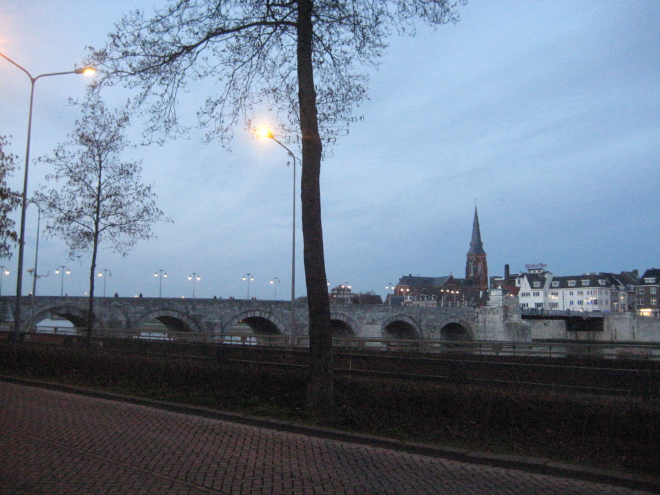
Picture of the “old bridge” downtown Maastricht.