Overheard in London: The Three Pillars of English (and Painting)
Eating in a London café can put you shoulder to shoulder with fascinating strangers. A few weeks ago, I was eating at an Italian restaurant in South Kensington, around the corner from the Victorian & Albert Museum. I overheard a conversation between a museum curator and a Russian journalist about the English language. The ideas they shared could have application for those who are interested in maintaining a classical painting tradition.
The curator must have been in his early sixties and had the kind of impeccable British accent that indicates a certain education. He was being interviewed by a journalist with a thick Russian accent, who was doing a feature on the Victoria & Albert Museum. Throughout their conversation, it was obvious that the journalist’s–a twenty-something woman–grasp of English left her struggling with many of the difficult words he was using. (They would have been difficult for many native English speakers.) Her frequent pauses for clarification took them from the topic of the interview to a discussion on the English language. The curator launched into what sounded like a well-rehearsed and delightful lecture on the “three pillars of English.”
“Words,” he said, “should be treated like endangered species.” He continued:
Whenever I find a word that has fallen out of favor, I write it down and make a conscious effort to use it and, then, reintroduce it as best I can. Such efforts, though minimal, are not insignificant. They breathe life into a dying language
“Dying language?” the journalist asked, “Isn’t English more dominant than ever?
This is when his thoughts lifted off the ground. He explained his theory:
English is based on three pillars:
- The Classics in Greek and Latin;
- The Annotated Version of the Bible [King James Version] ;
- And, Shakespeare
Once we loose an understanding of these three things, the language founded on them will die.
He went on to explain that no one learns Greek and Latin anymore, let alone the English translations of the books they once read in Greek in Latin, except for cursory school assignments at a young age. He lamented the loss of religion, and said that it seems that only a small number of enthusiasts are interested in Shakespeare today.
It was a cynical view of English and, after having talked with a linguist friend of mine, a view of language that is not widely shared by linguists. However, I don’t think it can be dismissed, and it seems to have application for a more than just language.
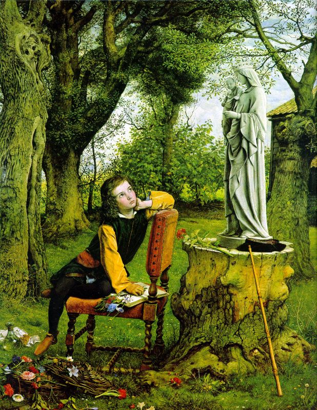
There is a rising generation of artists who are attempting to reinstate Academic painting, last practiced in earnest in the nineteenth century and most notably taught in the French Ecole des Beaux-Arts, the English Royal Academy, and the Spanish Escuela de Bellas Artes de San Fernando. These schools, for the most part, followed the same model which was based on similar pillars as mentioned by the curator.
I am in the process of researching the Spanish Academy in Rome, where the best-of-the-best of the rising generation of Spanish artists were sent for their final training between 1873 and 1913. Artists were sent to Rome by the government for three years. During the first year, they were required to copy an Old Master painting or Greek or Roman sculpture. For the second year, they studied the human figure. The third and final year was meant to combine all their skills in the production of a large history painting with its narrative drawn from religious or classical texts. The paintings would be sent to international competitions and, eventually, purchased by the State for the beautifying of public spaces.
These values in their education have a great deal in common with the curator’s three pillars and can be summarized as:
- Understanding of the Classics in the form of Greek and Roman statuary and architecture, based on ideal proportions, combined with studying Old Master paintings (e.g. Raphael, Titian)
- Narratives, provided by the Bible or classical texts, which provided widely shared, commonly understood and richly interpreted views of human nature.
- Observation of Nature
All three of these have been present in painting since the Renaissance. Should anyone continue to reinstate the technique of artists in the tradition, in my opinion they must also have a grasp of these foundational pillars; or, at least, a strong substitute.
Forgotten Master: Francisco Pradilla y Ortiz (1848-1921)
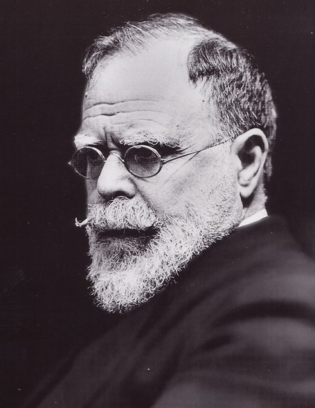
Francisco Pradilla y Ortiz. Photograph of the Painter (a. 1910)
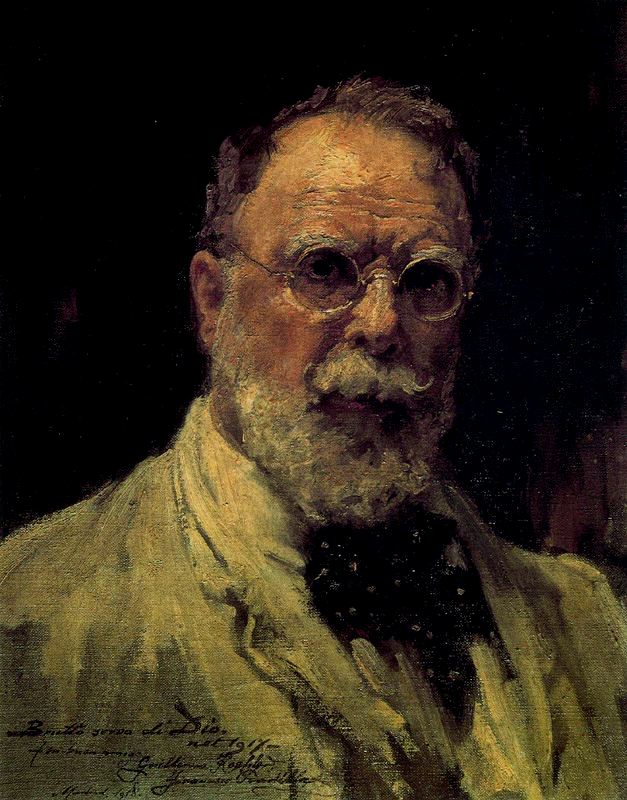
Francisco Pradilla y Ortiz. Self-Portrait (1917). Oil on canvas. 4.5 BY 35.5CM. Madrid, Prado Museum.
Pradilla was heavily influenced by Velázquez, Titian, El Greco and Ribera, all of whom are well represented in the Prado Collection. Even late in life, he regularly copied Old Master paintings in order to improve his own. This was accompanied by his lifelong dedication to the study of Greek and Roman texts, along with Spanish historical documents which inspired many of his paintings. He was well noted by friends for a large library of rare books and an ability to speak several languages.
Early Life and Training
Francisco Pradilla y Ortiz was born to a poor family in Zaragoza, Spain. He was accepted to the local Institute of Zaragoza. But, due to a lack of money, he was unable to pay for his own supplies and tuition and had to end his studies there.
Thereafter, Pradilla joined the workshop of the stage scenery painter Mariano Pescador. The work gave him needed money which he used to attend the Fine Arts School in the Academy of San Luis in Zaragoza and, eventually, move to Madrid.
In Madrid, he continued to make a living painting scenery for theaters. His ambition and talent eventually won him a place in the School of Painting and Sculpture at the Academy of Fine Arts of San Fernando in Madrid. In addition to his classwork, the records of the Prado show that, beginning in 1869, he regularly visited the Collection in order to copy Old Master paintings.
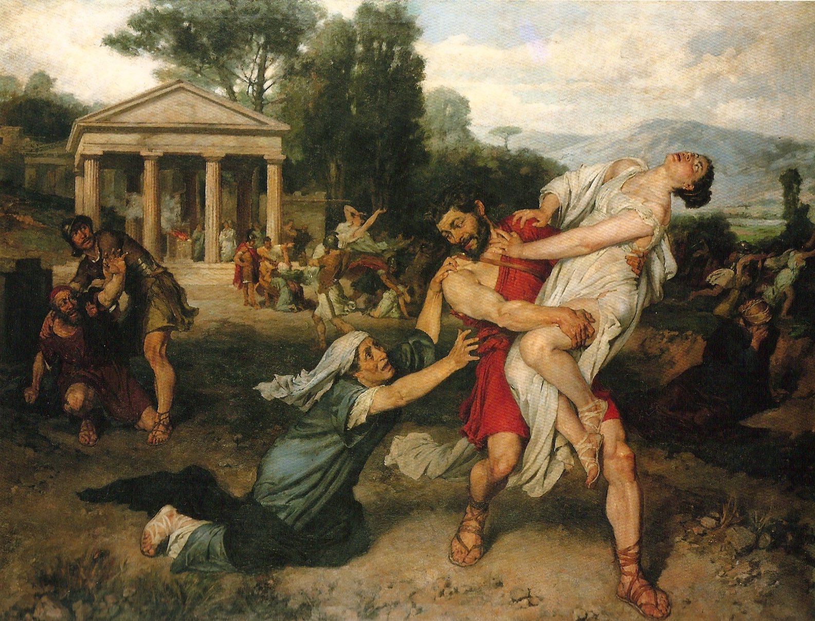
Rome
Francisco Pradilla y Ortiz. Náufragos or “Survivors of the Shipwreck” (1876). Oil on canvas. Madrid, Ayuntamiento.
Pradilla was among the first group of students given government scholarships to study at the new Spanish Academy in Rome, founded in 1873, but opened to students in 1874. The Spanish School in Rome would become the most important center for artistic training in Spain and Pradilla would become one of its most influential students (1874-1877) and teachers (1877-1896).
During three years, students were required to produce copies of Old Master paintings and Greek and Roman statuary, in addition to regular travel in order to encourage a broader perspective. While a student, Pradilla traveled extensively, visiting Venice, Florence, Milan, Piza, Paris, and six cities in Germany.
The culmination of each student’s study in at the Spanish Academy in Rome was a large, multi-figural history painting. In Pradilla’s case his final painting for the Academy would be an internationally-praised work.
DoJuana la Loca (Joanna the Mad Queen)
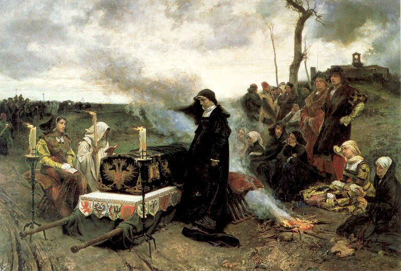
The painting depicts a scene from the life of the Spanish Royal Joanna (1479-1555), the second daughter of King Ferdinand II and Queen Isabella of Spain.
After the death of her husband, Joanna accompanied the body to its place of burial. Refusing to sleep or leave the casket, she kept vigil over the casket in torrential rain and winds. This, combined with other behaviors deemed as eccentric, estranged her from other royals. She spent the last years of her live in a convent.
Pradilla’s portrayal is notable for its underlying classical composition combined with Realism. In addition to his strong figural work, the painting reflects Pradilla’s understanding of landscape. He was a member of the Spanish Watercolorist Society, which specialized in disseminating landscape skills, and a student of the famous Spanish landscape painter Carlos de Haes. Several sketches for the landscape of Juana la Loca reveal the enormous amount of work he did to effectively portray the atmosphere, clouds, and ground convincingly.
End of Life
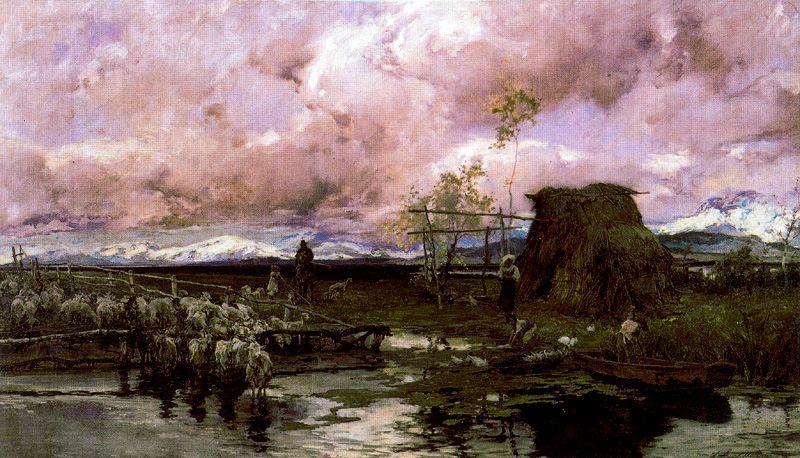
Francisco Pradilla y Ortiz. Landscape (a. 1900)
During the last years of his life, both the national government and the government of his birth, Zaragoza, would commission several works. But, he never repeated the success of Doña Juana la Loca, although he continued to paint in the same style.
Retrospectives of his life and works were held in Madrid (1948 and 1985) and Zaragoza (1985). Three of his major works are now held in the Prado, but the majority are held in private hands or regional museums and government buildings, especially in his native Zaragoza.
Forgotten Masters: Resurrecting an Appreciation for Artists Worth Remembering
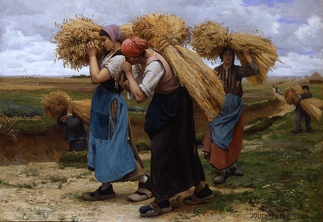
Julien Dupre, French, 1851-1910. The Gleaners (1880). Private Collection. Dupre is one of many artists that should be better remembered.
With the intent of helping to resurrect appreciation for some of the great and less-remembered artists of the past, I plan on regularly writing about what I will call “Forgotten Masters.”
Many nineteenth-century artists still sit in obscurity, not for lack of brilliance, but due to the shifting winds of culture at the end of the nineteenth and beginning of the twentieth centuries. The meteoric rise of Impressionism and other artistic movements left many academic artists, still at the peak of their talents, in the dust.
As we have distanced ourselves from changing fashions of those times, painters like Ingres, Gerome, Bouguereau, Eakins, Leighton, and Alma-Tadema have become more well known and received the recognition their works deserve through major exhibitions, scholarly books, and, finally, coffee-table books (the ultimate evidence that an artist has “made it”).
Yet we have only scratched the surface of nineteenth-century painting. According to a friend of mine, Dr. Vern Swanson, there were over 300,000 painters working in France in the nineteenth century.
300,000!
(For that number to sink in, here is an exercise: name as many French-Impressionist painters as you can. I come up with about 12 off the top of my head.)
Two websites, in particular, have been key in offering information and images of these artists:
- The Art Renewal Center: www.artrenwal.org
- Nineteenth Century Art Worldwide: www.19thc-artworldwide.org
If you have any nineteenth-century artists that you feel have been neglected and would like to see me post on them, please feel free to write me: mjc “at” beardedroman.com. Because my research is currently focused on Spain, many of the artists I will begin with in the series will be Spanish.
Starting tomorrow, look for posts tagged and titled “Forgotten Master.”
Neuroesthetics: The Science of Art and the Brain

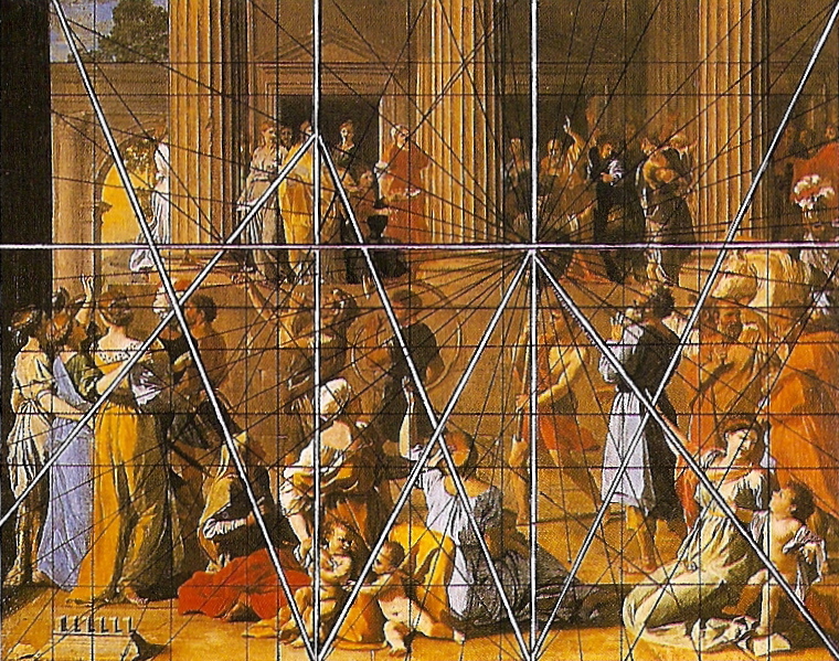
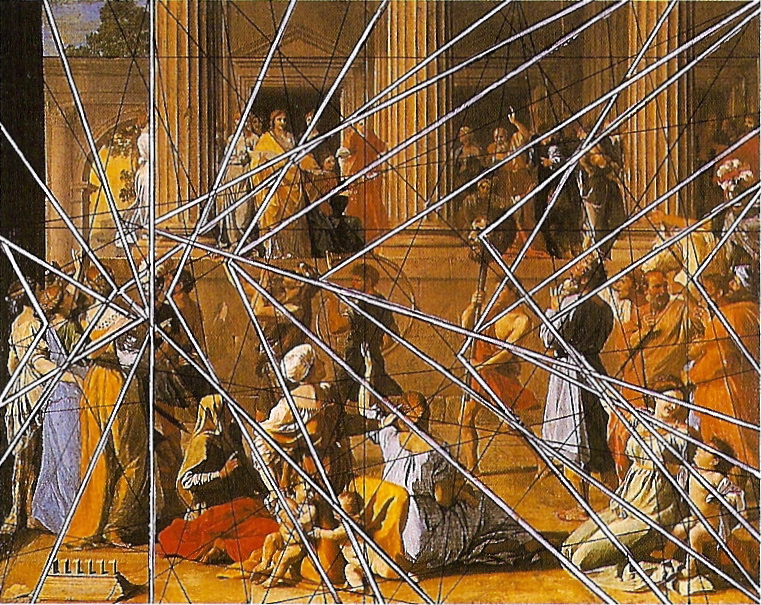
Nicolas Poussin (1594-1665) The Triumph of David. Oil on canvas. 118.4 BY 148.3CM. Dulwich Gallery, Dulwich, UK. Poussin is remembered for his highly structured paintings that influenced generations of artists looking for a more scientific approach to their painting. Three geometric analysis of this work are included in this article.
Over the past decade a new field of neurology has emerged, Neuroesthetics, with the intent of mapping the brain’s reaction to the fine arts.
The term “neuroesthetics” and the field was pioneered by Dr. Semir Zeki, who is the first Professor of Neuroesthetics at University College London, founder of the Wellcome Department of Cognitive Neuroscience at University College London and the Minerva Foundation at UC Berkley, where he is an adjunct professor. The website of the Institute defines its work as seeking “to establish the biological and neurobiological foundations of aesthetic experience.”
The notion of scientifically quantifying art might seem opposed a central purpose of art, which is subject to individual experience with an original work of art. In his long essay, What is Art?, Leo Tolstoy said it another way:
The activity of art is based on the fact that a man, receiving through his sense of hearing or sight another man’s expression of feeling, is capable of experiencing the emotion which moved the man who expressed it. To take the simplest example: one man laughs, and another, who hears, becomes merry; or a man weeps, and another, who hears, feels sorrow . . . And it is on this capacity of man to receive another man’s expression of feeling, and experience those feelings himself that the activity of art is based.
(Leo Tolstoy. Aylmer Maude, trans. What Is Art? Bridgewater: Baker & Taylor, 2000. p. 48)
Tolstoy’s way of describing art seems like a set up for a scientific experiment.
A scientific approach to art is not new. Many artists, most notably those of the Renaissance, approached art with a rigorous scientific mindset. The fifteenth- and sixteenth-century Italian schools of painting, especially in Florence and Rome, were concerned with geometry and the Golden Mean and were epitomized by the works of Leonardo Da Vinci and Raphael. European artistic training and up until the end of the nineteenth century, included classes in geometry and scientific theory. Impressionist and Divisionist artists, though rejecting traditional art, embraced new discoveries in color theory. In the twentieth century, the Futurist art movement applied current scientific understanding to effectively portray speed and movement on a canvas. Rothko was intensely concerned about the affect of color on the brain and was concerned about where his paintings would hang in case they would have an adverse results on the viewer (e.g. he believed that red was good for dining areas). I could think of a number of other examples.
The point is: science and art have been bedfellows for some time. So, it follows, why don’t we use science to futher improve our understanding of art?
In 2004, Dr. Zeki and his colleague Dr. Hideaki Kawabata published a study titled Neural Correlates of Beauty in the April 2004 J Neurophysiol journal of the The American Physiological Society. The study reports on an experiment where ten woman, with at least one college degree, were asked to rate paintings on a scale from 1 to 10, 10 being beautiful and 1 being ugly. (Note that the test controlled for a subjective experience with each painting, allowing personal preference and not scientific judgment to intervene.)
Each woman was placed in an MRI scan and, then, shown the paintings they rated in random order. The brain patterns of the women were mapped to determine whether or not the brain has has beauty or ugliness centers.
The conclusion of the study states:
The results show that the perception of different categories of paintings are associated with distinct and specialized visual areas of the brain, that the orbito-frontal cortex is differently engaged during the perception of beautiful and ugly stimuli, regardless of the category of painting, and that the perception of stimuli as beautiful or ugly mobilizes the motor cortext differentially.
(A PDF of the the full, published study, along with other studies by Dr. Zeki, can be found on the Wellcome Institute’s website: neuroesthetics.org/research.php.)
In other words, setting aside a personal interpretation of beauty, the brain has established neuro-pathways that are triggered when looking at a beautiful or ugly work of art.
As the field of Neuroesthetics expands it may eventually influence the art world. As an art historian, I am curious about what makes a work of art or an artist have a lasting impact. To find out art theorist often uses a highly subjective and, therefore, uneasy mix of soft science. Having a more scientific approach to what makes a painting work, would be a welcome tool in my belt.

The effect of this kind of research on working artists could be useful or damaging, depending on the intent of the artist. If an artist wants to learn what affects her work is having on her viewers– and, therefore, understand how to better hone those intended results–it seems very useful to use the ideas supported by neuroethetics. On the other hand, the last thing I would want to purchase it market-tested works of art. Thankfully, this doesn’t seem to be the intent of Dr. Zeki’s work.
Dr. Zeki has a blog, which he regularly updates: profzeki.blogspot.com. As the founder and leaders of the field of Neuroethetics, it is a good place to learn about his latest thinking.
Finally, A High-end Website for Classical Music Lovers
This isn’t your grandparents’ classical music . . . wait, it is. But, now it is accessible in a highly visually and professional format: Medici.tv.
Online broadcasts of classical music and opera are not new. The Metropolitan Opera and websites like ClassicalTV have been podcasting productions for some time. These services have often been limited in scope, focusing on performances from a specific venue, record label, or genre.
In addition these online services are often fee-based and require viewers to be on limited schedules. (For example, wanting to see a production at the Metropolitan Opera in New York featuring José Cura, I had to stay up late in London to watch the online broadcast.)
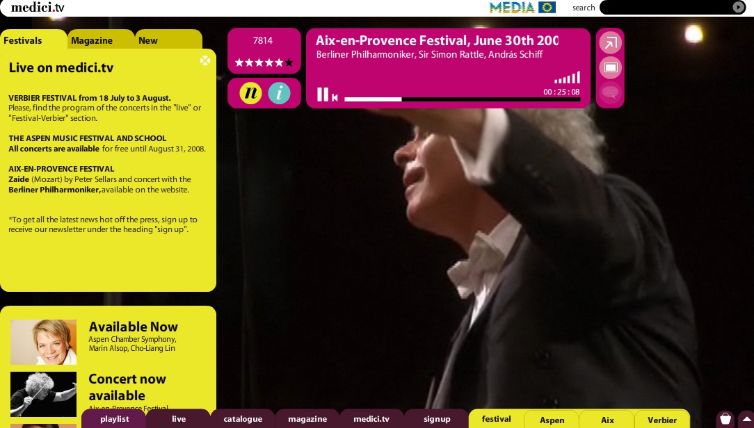
Medici.tv seems to correct many of these issues with a beautifully designed website. Though a subscription to its website gives users access to archives, anyone can go to the Medici.tv’s website and immediately view high-definition, multi-camera-shot footage of world-class performances free of charge.
Over the past three days, I have watched live performances from Music Festivals in Aix-en-Provence, France and Aspen, Colorado, in addition to two operas. (Having two computers will allow you to work on one while streaming performances on the other.)
I’m hooked.
Happy Fourth: The Declaration of Independence by John Trumbull
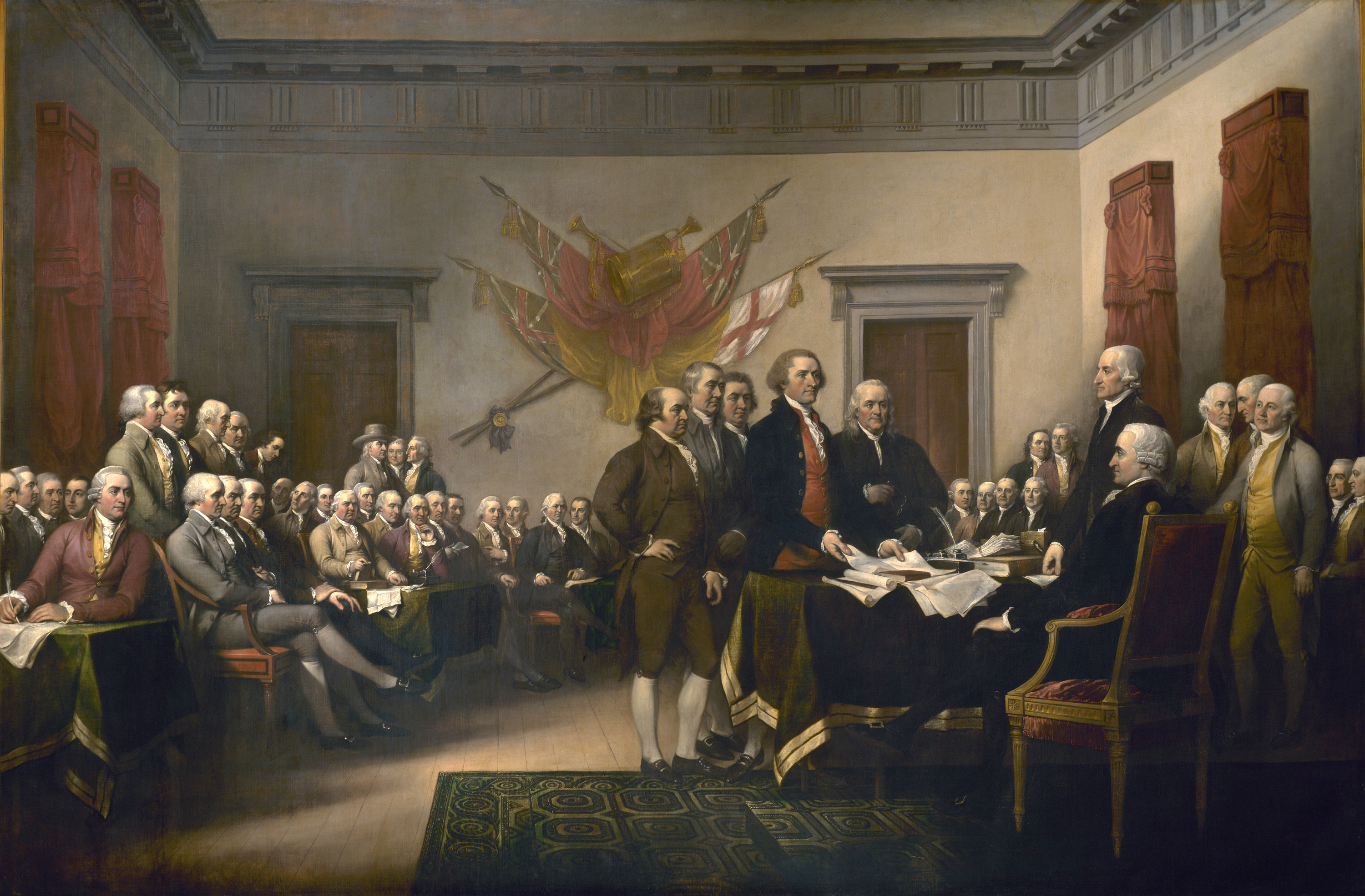
John Trumbull. The Declaration of Independence. (c. 1817-1819) 144 BY 216 IN. United States Capitol Building Rotunda. (Click on the image for a high resolution version.)
John Trumbull (1756-1843) was born in the Colony of Connecticut, where his father was the Crown-appointed Governor and the only Royal Governor to support Independence for the Colonies.
Using his family’s close ties to England, Trumbull studied and worked in the London studio of the British portraitist Benjamin West. While in Europe he painted the portraits of John Adams, serving as the Ambassador to England at the time, and Benjamin Franklin and Thomas Jefferson, who were both Ambassadors to the French Court. These portraits would later be incorporated into The Declaration of Independence.
The scale and multi-figural nature of the painting are ambitious. There are 47 portraits, all done from life. The painting itself was made over a period of three years. However, Trumbull, in his career as a portraitist in the Colonies, had gathered many of the portraits over f decades and brought together his sketches for this piece.

A key to the painting with the name of each figure.
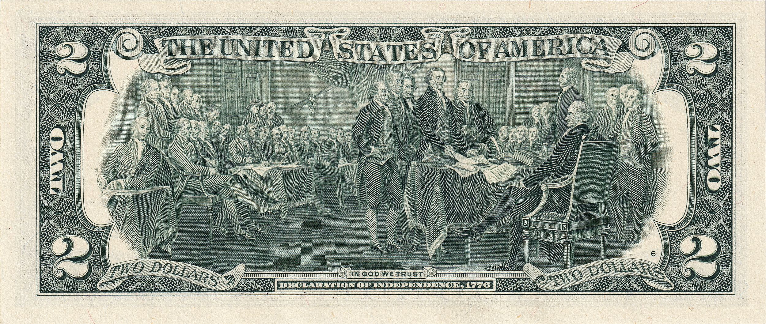
The painting was later used as the back of the two-dollar bill.
The Declaration of Independence was commissioned by the United States Congress to be hung in the Capitol Building. It is one of eight paintings of the same scale that Turnbull painted for the Rotunda:
- Surrender of General Burgoyne
- Surrender of Lord Cornwallis
- General George Washington Resigning his Commission
- Death of General Warren
- Death of General Montgomery
- George Washington before the Battle of Trenton
- Battle of Princeton
But, because Congress had only commissioned four paintings, the last four were sent or sold to other institutions.
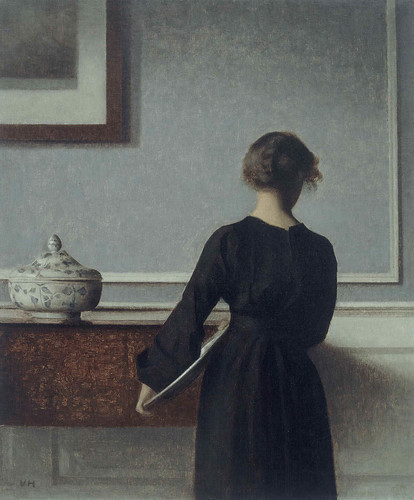
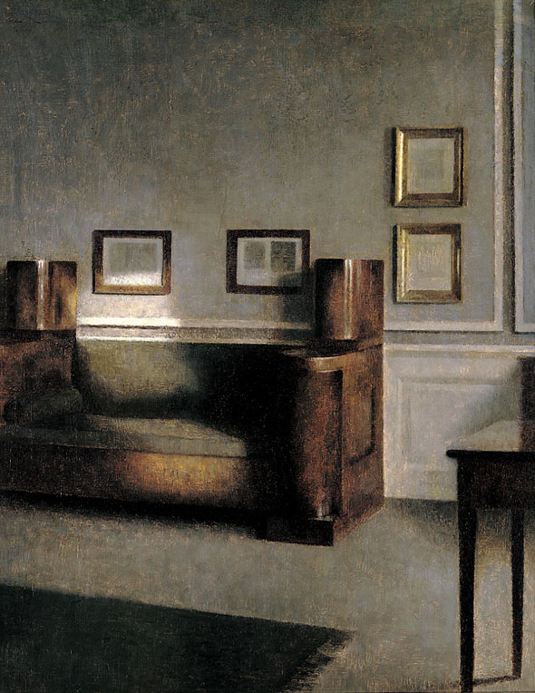
The Poetry of Silence: Vihelm Hammershøi at the Royal Academy in London

Vilhelm Hammershøi (1864-1916) was born in Copenhagen, Denmark. The exhibition, Vilhelm Hammershøi: The Poetry of Silence, at the Royal Academy in London displays more than 60 of Hammershøi’s works and runs until September 7. (It will then travel to Tokyo.)
Hammershøi received training at the Royal Danish Academy of Fine Arts, and produced a number of landscapes early in his career. After graduating he submitted a number of portraits to the Royal Academy’s annual exhibition, but was regularly rejected.
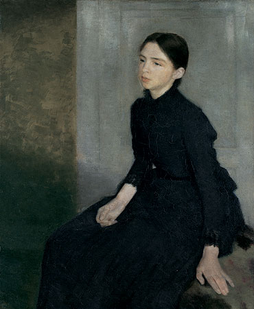
Portrait of the Artist’s Sister (1887) Oil on Canvas.
Instead of challenging the system, beginning in the 1890s Hammershøi began painting interior scenes of his home that usually featured his wife, Ida. These paintings were generally sold directly to patrons and only occasionally on public view.
Vilhelm Hammershøi. Interior with Young Woman seen from the Back (c.1903–04) Oil on canvas. Randers Kunstmuseum.
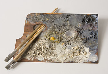
Vilhelm Hammershoi’s Palette.
Vilhelm Hammershøi. Sonnige Stube (1905) Oil on canvas, 49.7 x 40 CM. Nationalgalerie Berlin.
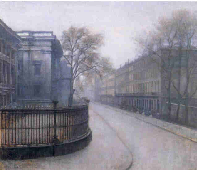
Vilhelm Hammershøi. The British Museum (c. 1905-1906). Oil on Canvas.
Thinking of the title of the exhibition, The Poetry of Silence, I was reminded of a poem titled Silence by Billy Collins:
There is the sudden silence of the crowd
above a motionless player on the field,
and the silence of the orchid.
The silence of the falling vase
before it strikes the floor
the silence of the belt when it is not striking the child.
. . .
The silence before I wrote a word
and the poorer silence now.
(Excerpt from Silence by Billy Collins. The Trouble with Poetry and Other Poems.)
For an antidote to the ever-busy lifestyle we all lead, I highly recommend finding a Hammershøi painting and sitting in silence for a time.
New Magazine: Prado

Cover of Prado. On the Cover Design: A Preparatory drawing by the sculptor Cristina Iglesias for the Doors of the Prado Museum’s new extension.
According to the last page of the magazine: “The format of Prado has the exact same proportions as the painting Las Meninas by Velázquez.”

Diego Velázquez. Las Meninas. (a. 1656) Oil on Canvas. Prado Museum, Madrid.
The Prado Museum–one of the most important museums in Europe–has begun publishing a new magazine simply titled Prado. A press release on the Museum’s website explains:
Starting this week, the new issue of Prado magazine will be available in the Museum’s shop. This magazine, the first issue of which was published last year, is a bilingual publication in Spanish and English with contributions signed by prestigious guests such as, in this issue, the photographers Gianni Berengo Gardin and Attilio Maranzano, the essayist, poet and playwright Hans Magnus Enzensberger, Príncipe de Asturias Award for Communications and Humanities in 2002, or the architect and Professor Juan José Lahuerta, amongst others The magazine includes the documentary in DVD Patinir and the Invention of Landscape.
The magazine is beautifully illustrated and written. Rather than a stuffy, academic publication, it looks more like a high-end architectural or design magazine.
I wonder why I have to go to Madrid to buy a bilingual magazine from an internationally-renowned museum. I was lucky enough to be at the Museum shop when this issue came out. But, I’m not going to Spain to buy each new issue.
The Museum website does raise the unspecified possibility of getting the magazine another way by stating in its press release: “Purchase by email: tiendaprado@museodelpradodifusion.es.”
French Academic Drawings with Examples by Ingres (1780-1867)
Three quarters of what constitutes painting is comprised of drawing. If I had to put a sign above my door I would write: ‘School of Drawing,†and I’m sure that I would produce Painters.
-Jean-Auguste-Dominique Ingres

Jean-Auguste-Dominique Ingres, Studies for “The Grand Odalisque,” 1814. Graphite on three sheets of paper, 10 BY 10 1/4IN. (25.4 BY 26.5CM.). Département des Arts Graphiques, Musée du Louvre, Paris.
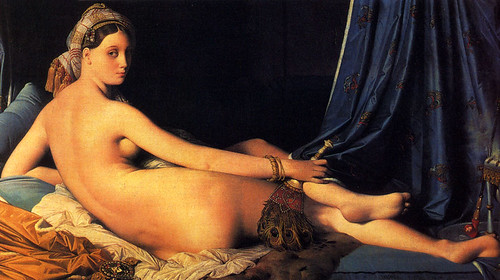
Jean-Auguste-Dominique Ingres, The Grand Odalisque, 1814. Oil on canvas, 35 1/4 BY 63 3/4IN. (89.66 BY 162CM.) Private collection.
Drawing was the fundamental teaching of the French art education system, a model that spread to the rest of the world.
In its original, seventeenth-century coursework, students submitted to a daily regimen beginning with copying modeles de dessin, plaster casts, and individual body parts. After years of practicing from inanimate objects, talented students were allowed to draw directly from nude models and compete for government commissions for work on the merit of their drawings.
Drawings Produced from 1800 to 1850
In the process of their study and work, nineteenth-century artists created specific kinds of drawings with distinct purposes. Because there was no widely recognized market, drawings were not made for the purpose of sale. Instead, the public purchased paintings or prints. However, this did not mean that the drawings were considered to be valueless. In the tradition going back centuries, David and Ingres kept stored and labeled drawings, and sometimes used them for instructional purpose.
Most of the drawings included in this post are by the prime example of academic drawing of the period: Jean Auguste Dominique Ingres (1780-1867). Ingres was the undisputed leader of the École des Beaux-Arts after the death of David. Ingres was David’s star pupil and had been awarded the Prix de Rome from the French Government, allowing him to study directly from classical works in Rome. He returned to Paris in 1841 and dominated teaching at the École.
EDUCATIONAL DRAWINGS
Individual parts of the body, from the plaster cast
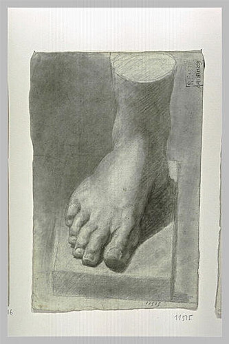
Anonymous study of plaster foot. Musée d’Orsay. Paris, France.
Before students were allowed to work on the human figure, each was required to produce convincing two-dimensional reproductions of plaster casts made from ancient statuary. Greek and Roman works were considered representations of ideal beauty, and were often created using complex mathematical equations in pursuit of the Golden Mean.
The intent of this approach was to firmly establish a foundational concept of the human body in each student’s practice before he or she encountered wide-ranging variation in the natural human figure.
From the Nude
From the early Renaissance to the mid-nineteenth century, mastering the human body was considered the supreme challenge and goal of academic painters.
This foundation was especially necessary for commercial success in France, where the most lucrative commissions came in the form of patriotic history paintings comparing the new French Republic to classical democracies in Greece and Rome.
The live drawing sessions were overseen by the head teacher of the École. In the beginning of the century, David arranged the school’s schedule around live model drawing.
The art critic Etienne-Jean Delécluze described the approach of Jacques-Louis David, who is responsible for the trajectory of the École in the first half of the century:
“in the eaves . . . facing the Pont des Arts . . . the model was posed twice a week, or rather every ten days, at the time. For the first six days the model was posed nude; the last three days, a model for the head only, and the studio was closed on the tenth day.â€
These drawings did not relate to any particular painting, but were understood to assist the painter in his mastery of the human figure.
Years after receiving his first lessons in drawing the nude from David, Ingres was one of the most prominent portrait painters in Europe. In a surviving drawing, we can see that even when working with a fully-clothed sitter, Ingres used his understanding of human anatomy to understand the structure of the body beneath the clothing.
Jean-Auguste-Dominique Ingres. Study for the “Portrait of the Baronne James de Rothschild,†c. 1848. Graphite on paper, 8 BY 5 1/8IN. (20.4 BY 13CM.). Musée Bonnat, Bayonne.
I’m fairly confident that Ingres died not tell the Baronne that he was imagining her in the nude.
PREPARATORY DRAWINGS FOR PAINTINGS
There were, broadly speaking, three classes of drawings created by artists trained in the École in the process of making a painting: the première pensée, the esquisse peinte, and the croquis. Again, Ingres will be used as the example.
The première pensée
Drawings were seen as the beginning of the painting process. An artist’s first idea, or première pensée, would be captured in a rough sketch with the intent of developing composition. Successive drawings would develop the idea found in the original and create a clearer or more thoughtful expression of what had only originally been sketched. Detail such as figures, stance and gestures come into focus.
Jean-Auguste-Dominique Ingres, Study for “The Odalisque with a Slave,” 1839. Pen and ink on paper, 6 1/4 by 7 1/4IN. (16 BY 18.5CM.). Musée Ingres, Montauban, France.
Jean-Auguste-Dominique Ingres, The Odalisque with a Slave. 1839.
The second stage of drawing used by Ingres is referred to as the esquisse peinte and is used as a complete road map for the final painting. Much larger than the première pensée, it was often drawn to the scale of the final painting directly onto the canvas and then painted over by the artist.
Jean-Auguste-Dominique Ingres, Study for “The Odalisque with a Slave,” 1839. Pen and ink, white pastel, and gouache on paper, 6 1/4 by 7 1/4IN. (34.5 BY 47.5CM.). Louvre. Paris, France.
The croquis
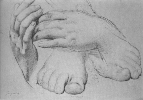
Jean-Auguste-Dominique Ingres, Study of Hands and Feet for “The Golden Age,” (1862), graphite on paper. Louvre, Paris, France.
Throughout the drafting process, areas of the painting that pose particularly difficult challenges (e.g. hands, feet, linen folds, facial expressions) are drawn sometimes multiple times and in multiple positions. In this way the adage of “measure twice, cut once†was applied to painting. In this way the artist could test multiple approaches to individual areas of the painting without jeopardizing the entire work.
Surprised by Alphonse Mucha in Madrid
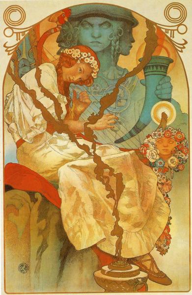
I went to Madrid to continue research on Spanish painters, and left with an obsession for the Czech painter Alphonse Mucha (1860-1939).

Photograph of the CaixaForum building’s vertical garden.
While walking to a cafe next to my hotel, I stumbled onto an exhibition on Mucha. Titled Alphonse Mucha: Seduction, Modernity, and Utopia, the exhibition is a joint effort between CaixaForum and the Mucha Foundation. It will be on show at CaixaForums new building, located across the street from the Prado, until August 31.
The CaixaForum is the cultural wing of the Caixa Bank. Banks in Spain are required by law to use a percentage of their profits for cultural purposes. As a result, many important exhibitions, like this one, have come to Spain in the past few years. As a rule they are free to the public, and are almost always accompanied by beautiful catalogs. Unfortunately, these catalogs, like the one accompanying the Mucha exhibition, are almost never available in stores or online.

Alphonse Mucha was born in Moravia (the modern-day Czech Republic). At the age of 25, he began studies at Academy of Fine Arts in Munich. Two years later, he would move to Paris and study at the prestigious Academie Julien in France.
Eventually, he would become friends with Gauguin and participate in Symbolist art shows with Bonnard, Grasset, Toulouse-Lautrec, Mallarmé and Verlaine. His participation in Symbolism, which has underlying metaphysical and religious beliefs, went hand in hand with his participation in Freemasonry.
Mucha was initiated in the Masonic Lodge of Paris in 1898 and continued to practice Freemasonry until he died, including references to it in many of his works.
One of my favorite moments in the exhibition came from a group of school children visiting at the same time I was. Their teacher asked them: “Does anyone know what a Masonic Lodge is?” The students seemed puzzled and no one was able to answer the question. Lesson: Don’t expect a group of students in a country where 94% of the public is Catholic to know much about Masonry.
Besides being an important Symbolist, Mucha was one of the most influential players in the development of Art Nouveau, for which he is most remembered.
His Work
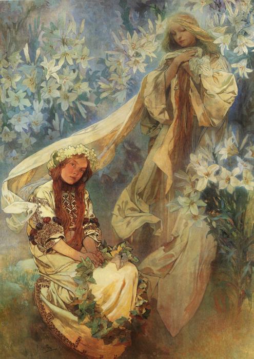
Alphonse Mucha. Madonna of the Lilies. (1905) Oil on canvas. Mucha Museum, Prague
In contrast to the posters, the oils are full of light and use a generous palette. His ability to gradate from one color to another is extraordinary. While looking at The Apotheosis of the Slavs (1926), I thought of late-fifteenth-century paintings by Bellini, where he was just beginning to use oil rather than tempera, egg-based paints. Almost overnight, Bellini was able to make smooth shadows and gradual changes in color that were previously impossible. Mucha seems to crown nearly five hundred years of oil painting with a symphony of color that seamlessly glides from one bright color to another.
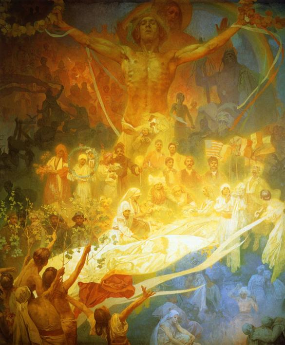
The Slav Epic
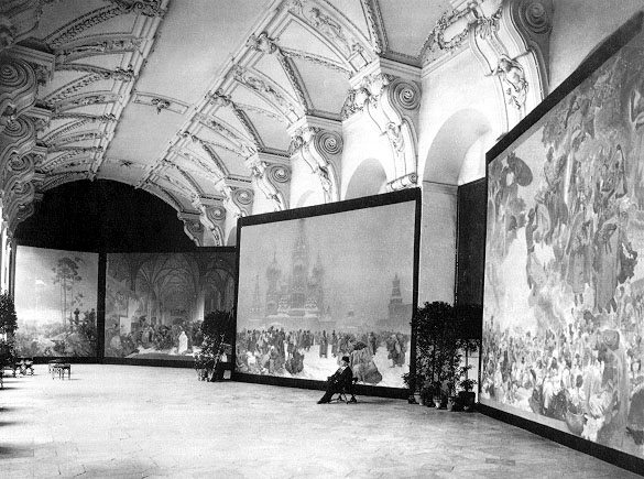
Photograph of Alphonse Mucha at the opening of the Exhibition of The Slav Epic. (1919) Klementinum, Prague.
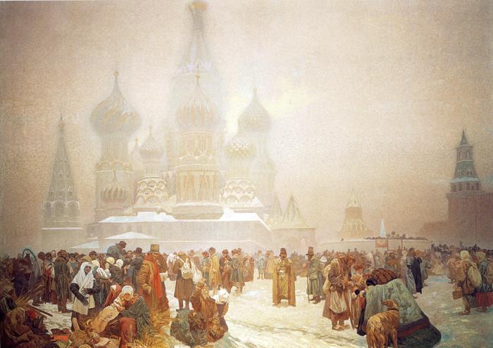
Alphonse Mucha. The Abolition of Serfdom in Russia. (1914) Tempera on canvas. Mucha Museum, Prague
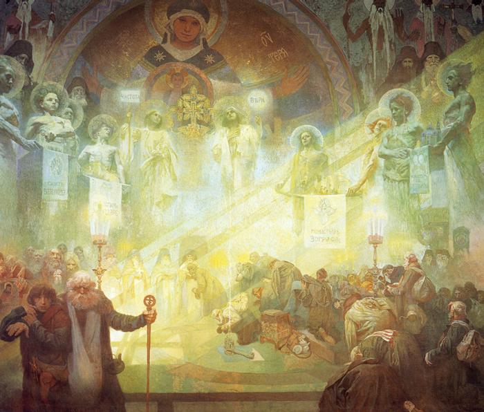
Alphonse Mucha. Holy Mount Athos. (1926) Tempera on canvas. Mucha Museum, Prague