It is no surprise that taste and knowledge sometimes go hand in hand. But claiming a preference for Bach or Bruce Springsteen can be directly correlated with one’s social status (e.g. education, wealth, social connections) seems patronizing at best. So, when the social scientist Pierre Bourdieu published Distinction: A Social Critique of the Judgement of Taste, he was considered an elitist snob. Bourdieu summarizes the book by writing:
“Taste classifies, and it classifies the classifier.”
Distinction was recommended to me by a professor who made the argument that abstract art and neoclassicism had essentially the same goals and audience: both genres were far-removed from reality and steeped in symbolic messages. The intended audiences were the elite and hyper-educated. The notion that Jacques-Louis David and Pollock could share the same audience seemed laughable at the time. Yet, Bourdieu’s data and cogent analysis seem to confirm the comparison.
First published in 1979 in French, Distinction is based on an extensive survey of 1,217 adults from a variety of social backgrounds, careers, and levels of education. Bourdieu’s team of researchers asked participants about tastes in music, literature, movies, art, and food. Graphing responses according to social markings revealed fascinating patterns. For example:
- Industrial workers with associates degrees preferred listening to Edith Piaf, paintings by Renoir and eating at buffets. They were the least likely to visit museums or read books.
- Those with four-year degrees were drawn to the singer Jacques Brel, Goya, Van Gogh, and abstract painting.
- Craftsmen–those with specialized, non-formal training–admired Raphael, Leonardo Da Vinci and Watteau as artists and enjoyed popular music from America.
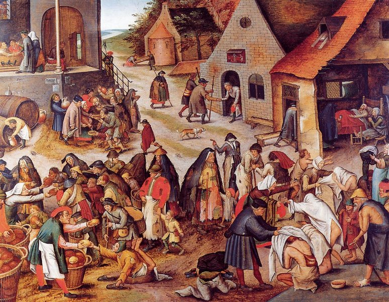
- The most educated respondents, university professors, named Bach as their overwhelmingly favorite composer and listed Picasso, Braque, Brueghel and Dalí as preferred artists.
In the introduction, Bourdieu summarizes his conclusions:
” . . . working-class people expect every image to explicitly perform a fucntion, if only that of a signe, and their judgements make reference, often explicitly, to the norms of morality or agreeableness. Whether rejecting or praising, their appreciation always has an ethical basis.”
He constrasts this with another approach to art:
“The denial of lower, coarse, vulgar, venal, servile–in a word, natural–enjoyment, which constitutes the sacred sphere of culture, implies an affirmation of the superiority of those who can be satisfied with the sublimated, refined, disinterested gratuitous, distinguished pleasures forever closed to the profane.”
Bourdieu is obviously taking sides, justifying a commonly-held belief that realistic, spiritual, moral, or sentimental works of art are preferred by those who are less educated and “vulgar.”
Often, when I share with other art historians or professionals that my current work is on nineteenth-century academic painting, I am met with Bourdieu-esque comments that reflect the belief of the superiority of almost anything but academic painting, including folk or primitive arts. The dismissal of the academic aesthetic has become so pervasive that the study of it seems either Quixotic, which would mean it retains some inherent value; or, as is most often the case, idiotic. History painting, realism, and naturalism–all distinct and hotly debated in their time–are now lumped together and disdainfully labelled as “popular.” I have come to wear that as a badge of honor, which puts me in direct opposition to many of Bourdieu’s conclusions.
At their most fundamental Bourdieu’s conclusions assume that humanity’s greatest truths are complicated and that the abstraction of ideas is the most direct path to understanding the “sacred sphere” where truth resides. I do not believe this. I love the Well Tempered Clavier and Dagnan-Bouveret.
Whatever your opinion of its conclusions, Distinction is a remarkable read. I found myself alternatively patting myself on the back and writing angry marginalia.
Dear Bearded: I would really like to read your post but the dark gray on black text makes this impossible. I wonder if you know this. I like the black, because one sees the paintings better, but the new gray is difficult. Best. Balsamfir
I’m really grateful for your feedback. The last thing I want is have an unreadable post. I’ve tried a number of different templates for the website with varying levels of readability. Unfortunately, it’s been a difficult balance between making the images stick out versus the text. I’ll keep trying to find one that is can do both.
The preferences of the most educated respondents—Picasso, Braque, Brueghel, and Dali—are exactly the titles one finds on the bargain books table at Borders, et al, which leads me to conclude their acquaintance with art is passing at best. Surely the mind that can wrap itself around the compositional ingenuity of Bach should prefer in art a comparable ability to organize themes and figures in pictorial 3-D space, like that of Rubens, Tiepolo, or other masters of the late Baroque. The abstract ingenuity of their art makes complicated, chaotic subjects readable and beautiful much the same as Bach writes complex counterpoint that the ear can actually follow and enjoy. To appreciate the equivalence one must be aware not only of the whole field of art, but of the abstract nature of drawing itself, even where the goal is realism. It sounds as if the sophistication of those respondents is merely an acquired academic prejudice that ignores the essence of visual art.