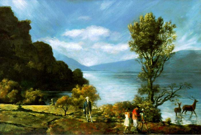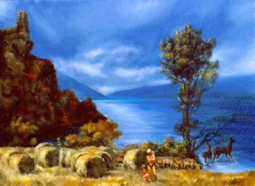
What if we made art according to surveys? What if artists, like many politicians, relied on polls? This week, the public radio show This American Life features an interview with two digital artists, Vitaly Komar and Alex Melamid, who received a grant from Chase Manhattan Bank to determine the attributes of the most and least wanted painting. To do this, Komar and Melamid conducted a number of online surveys allowing participants to choose their favorite elements from famous works. The result has been called the “most wanted” painting.
Having read through study, it is difficult to determine the level of professionalism in its methods. The results were only published online and were never peer reviewed. Regardless of its integrity, it is an interesting exercise.

Of the dozen countries represented in the study, all of them, with the exception of Holland, preferred realistic landscapes. The Dutch, for reasons unexplained in the study, value abstract art, which, for most other countries, is the “least preferred” type of painting. The contents of the “most wanted” are surprisingly uniform:
- landscape
- mountain on the left
- tree on the right
- wild animals
- gathering of people
- famous political figure
- strong blues
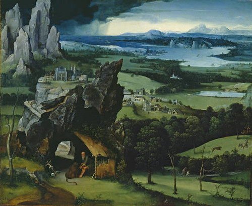
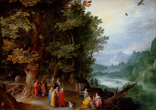
The elements read like a description of any number of sixteenth-century Flemish paintings.

Several years ago, I had a conversation with one of London’s foremost dealers of Old Masters paintings. He told me that, of all paintings, landscapes were the most popular in his gallery. When asked “Why?” he responded: “I suppose it is because they are the least controversial. They can be enjoyed without taxing the viewer. And, they do not make any overt political or value statements that need to be defended.”

No doubt there are many reasons to love these paintings that have little to do with political correctness. Personally, I love works by Patinir and Jan Breughel. They were often small and, rather than hung on a wall, meant to be looked at while holding them on a lap with with a magnifying glass. The paintings are full of rich detail, distant views, and multiple paths. These are works that can be looked at again and again, each time with a new discovery.
The idea that painting could be put together by committee flies in the face of our belief in the lone genius painter. However, in their public radio interview the authors of “The Most Wanted Painting” study are quick to point out that the notion that our ideas about a creative genius are just as clichéed and inaccurate as our judgment that painting by polls are somehow unable to create good art. Though I am not suggesting art should be created by polling, I would suggest an adjustment to anyone attempting to repeat and improve upon the “most wanted” painting.
Several years ago, Malcolm Gladwell, author of many books and a writer for the New Yorker, gave a lecture on “What we can learn from spaghetti sauce.” In it, he profiles a food scientist that found that instead of trying to satisfy the American palette with one perfect spaghetti sauce–the unreachable Holy Grail for food production industry-we should be looking for the perfect sauces. According to taste testings, Americans fell into one of three categories of spaghetti sauce. The same proved true for coffee and a number of other foods. As a result, most companies produce a limited variety of each category of food to meet the needs of each general group’s taste.
If I were a gambling man, I would bet that the same would be true for the “most wanted” painting. Perhaps someone reading this would be able to convince Chase Manhattan Bank for a second grant.
Fascinating post!
I have a theory about why people instinctively, overwhelmingly prefer landscape painting, but it’s purely retinal. As follows.
While the mind and the spirit may be seeking many kinds of stimulation, the eye is constantly seeking repose. One way this happens, looking at a view or at a painting, is for the eye to travel in and out — through tree branches, beyond bodies of water — over distant vistas, and back to the foreground. The eye experiences this as deeply restful. The same purely optical sense of repose can be achieved by looking at an abstract illusion of deep space — formed by concentric circles, for instance — or one in which colors are positioned to suggest a recession into space, with warm colors advancing and cooler, hazier tones receding. We know this without knowing it, and want to look at paintings that grant us this deep refreshment.
Just for fun, think of 10 of your favorite landscape paintings — having a fairly high number like 10 will help with the thought experiment. Then see how many of them involve deep distance, with elements that help the eye to judge the deepening distance — a stand of trees that can be seen through, or a stream that winds, for instance. After that, check how many of the painters have troubled to paint clouds and other atmospheric effects that do not make the sky busy but subtly allow its distance to be grasped. Last of all, notice how many of these favorite landscape paintings have a high horizon — all but the Dutch ones?
I think all this is deeper than mere convention, or a “sells like hotcakes” formula. And deeper than culture, too, although cultural explanations for why a thing is popular are fascinating. But some things, we may not be attracted to simply because it feels awful to look at them. Art that is described as “confrontational” or “tough” is often optically rough going rather than psychologically penetrating or intellectually difficult. Those are not the same things, any more than bad landscape painting — calendar art — cunningly using all the selling points above succeeds better than good painting with many fewer of them.
amazing! i loved reading this. and i love your new format.